26 March, 2021

Zoology

We're heading into a new two-week task over at the Alphabet challenge, finishing the alphabet with the letter Z. That being said, we'd like to see your "zoology" inspired creations.
I for myself decided to work with napkin decoupage this time, creating small decorative objects like the ones I've made a while ago. Unlike the floral pieces, however, I used the motif of ladybugs.
I cut them from a handkerchief and placed them randomly onto a couple of wooden discs.
On the front, the wood is painted with white acrylic paint, which makes the bugs standing out nicely. On the back side, I used a vibrant red colour, but it didn't occur to me to turn the pieces around during the photo-shoot on Wednesday, and I didn't have the time (or the mood) to take them out again yesterday. Ooops!
I'm not sure about the use of the discs to be honest. I might try to turn them into some kind of Easter/spring decoration, or maybe place a magnet on the back side to turn them into fridge magnets? Or just keep them as they are - some kind of lucky charms?

challenges:
krafty chicks: all occasions
613 avenue create: ATG
a bit more time to craft: ATG
a place to startpick a shape (circle)
as you like it: favourite springtime critter (I've chosen ladybugs for this one, because they're one of the first animals buzzing around when the days become warmer. It might not be a common pick among all the bunnies, but Easter can be quite late in spring sometimes, plus I've never really seen a bunny/hare out in the wild. Ladybugs are more "tangible" to me, and the sighting of the first ladybug is a spring-milestone every year.)
C.R.A.F.T.: spring/Easter
love to craft: ATG 

23 March, 2021

Twofer Try

Just a quick try for the current twofercardchallenge before the link-up runs out. 
I didn't plan to do last-minute entry this time, but I've only received my digis from All dressed up a couple of days ago. But how could I not do a last-minute project then? 
I've wanted to try this "twofer" thing for a while now and admire the DT works every month, however, I never really took my time to create two very different things using the same digi. It does take a bit of a twist I guess, two different moods, colour pallets and what not, and I just never felt like I could complete the task as the themes went by.

Recently, though, I found myself as one of the winners over at the All dressed up challenge blog. As I was browsing through their shop to select my prize package, I couldn't help but fall in love with this adorable sleeping bunny. Call me weird, but my immediate thought was something along the lines of "This would look so delicate on a baby's sympathy card". 
While I've been waiting for the digis to arrive, I began to make arrangements in my head as to how it should look like. Once the digis arrived, I went to work. At first, I printed the digis and sentiments, then, I picked a stack of patterned papers that could match my idea. I've also completed my twofer idea in my head: for one project, I kept the idea of a sympathy card, while the other would be a classical thing of "Welcome baby".
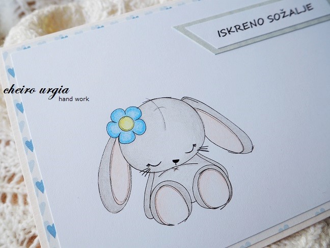
I decided to do the happy occasion first, by colouring the bunny in soft brown shades. I picked a pink polka dot paper for the background and added an additional layer of baby-themed embossed paper. In the dend, I placed the bunny on a sheet of pink cardboard and placed a simple "Welcome" sentiment in the lower part of the card. I wanted to add a couple of flowers, too, but I thought shipping will be easier if I keep the card flat.
It is your typical sweet pink baby card even though I lalety realized I'm not a fan of gendering baby items according to stereotypical girls' and boys' colours. I shall do better in future and try to broaden my mindset when it comes to crafting, I promise. 
For the second card, I planned a very CAS design. I opted for a background paper with hearts even though not many of them are visible. I wanted to colour the bunny in a light brown shade at first, but thought that maybe a really light grey is more appropriate for the occasion. I tried to colour the motif by barely touching the paper with my pencils to make sure the colours will be really soft and calm. In the end, I placed a simple line of sympathy in the top right corner of the card.
I'm not sure whether I managed to create something appropriate here, so I'd really like to hear your thoughts. I know that many crafters aren't comfortable with sympathy/condolence cards in general, while I like to create one every now and then. They do have something of a meditation to me, a task that lies not in the card itself, but in the message it brings. 
However, I've never really seen anything suitable for a child, let alone a baby. I can't even imagine how the loss of an infant affects ones life, and I guess with many people feeling this way it leaves the affected families even more alone in their grief. Maybe, if we could just keep our prejudice under control here, the wall of silence wouldn't be so scary for those who'd like to open up about their loss? 
I believe that most of the not-talking comes from a well-intended "not knowing what to say" or "not wanting to say something wrong", but ignoring the topic won't make it disappear, and most importantly won't diminish somebody's agony. 

challenges: 
krafty chicks: CAS
all dressed up: cute critters
always fun challenges: welcome baby
as you like it: favourite way to cut your image (I'll usually go with a square cut that I create with an olfa knife and a ruler, which makes it possible for me to adjust the height and width of the image. I like the idea of controling how much background paper I want to show resp. hide, without spending too much time on fussy cutting with my small scissors or spending money for expensive cutting devices)
love to craft: ATG 

22 March, 2021

Spring flowers

I haven't been around much during winter - not around people, not around town. Partly it was due to the cold, which seems to bother me more and more each year. Mostly, though, I just try to organize my errands in a way that makes it possible to get my things done without getting caught in crowds. 
That being said, I still do visit the farmer's market about once a week, but I'll pick the days that are less busy to do so. And once I have my groceries, I'll usually stroll past the flower stands, too. I might not always pick something, but I just couldn't resist this wonderful bouquet. I probably wouldn't pick such a huge arrangement for myself, but the flowers looked so pretty and I felt like gifting myself, so - why not?
I haven't changed anything about the bouquet once I came home, except for cutting the stems to make them fit into a simple Swedish glass vase. 
The variety of blooms is quite interesting to me, and I like how there's lots of colour, but also lots of white. Especially, I like how the addition of grape hyacinths creates a wonderful spring feeling. 
A contribution to the Friday Flowerday at Holunderbluetchen.

12 March, 2021

Yellow

I'm a bit for the Alphabet challenge today as I had a couple of doctors' appointments today and my DT contribution didn't post automatically as it should have. Anyway, we're having a colour theme this fortnight since the letter Y calls for "yellow" on your projects. 
I had to go home two weeks ago, meaning I wouldn't have access to my crafting stuff - a realization that only hit me two days before leaving! The solution was simple: I'd have to come up with something, and I'd have to come up with it fast. The limited time meant I'd have to go with something CAS, and once again, I was saved by the wonderful digis of bugaboo.
I've chosen a simple flower to work with, but didn't use quite a lot of yellow on the image itself. Instead, I opted for a bright yellow background paper, which has a floral pattern embossed on it. As usual, I placed the coloured image on an extra layer of coloured cardboard. The dark brown makes sure the attention stays with the other colours, and also complements the kraft card base. For a bit of fun, I added two strips of ribbons: a green one with clovers, and a red one with white dots on it.
Since their ends would go over the front part of the card, I decided to cover them up by using a punched ornament in yellow and white. I think it does resemble a flower if you use your imagination.
On the inside of the card, I added three smaller blooms made of lace, which complete the floral theme of the card.
Instead of a hand written note, I placed a cutout from a magazine that could be translated as "What makes you feel brave and strong?" It's a rather difficult question to ask yourself, and even more difficult to answer, but it's worth a try. 
The card was meant as a cheer-me-up for mom, which is why I've worked with unusually bright colours, lots of floral things and an overall fun and easy design. It was well received, but the answers might take some more time. 

challenges: 
613 avenue create: ATG
a bit more time to craft: ATG
a place to startpick a shape (rectangle, ellipse)
as you like it: favourite way to cut your image (I'll usually print my images on white paper and cut it to the right size using an ordinary Olfa knife and a ruler. With thicker paper or cardboard, I'll sometimes work with my small scissors to fussy cut, but most of the time I prefer a square shaped cut-out which gives me the opportunity to adjust the height and width of my image. I like how changing the amount of white space around your motif can change the perception of the whole image, and consequently, your whole card.)
C.R.A.F.T.: feminine
crafty calendar: feminine
crafty catz: ATG
crafty sentiments: ATG
creative moments: ATG
cutie pie challengeblog: bunnies & blooms (Valentines or mother's day)
love to craft: ATG 

04 March, 2021

Heralds of spring

Just a quick contribution to the Friday Flowerday at Holunderbluetchen
While I don't have a bouquet for every week of the year, I will certainly have a little arrangement of snowdrops in my apartment each spring. I'm lucky to have them in front of my apartment building where they get quite a lot of sunshine, so I've been waiting for their blooms to open since January. By beginning of February, the snowdrops began to peak from the ground, and mid month they were in full bloom. 
I thought I'd let them grow peacefully this year, but I plucked ab few when I went visiting mom - and they were quite an eye catcher as we had a huge load of snow back home! 
I put them in a small green vintage vase and restrained myself from adding anything else, because, honestly, what could come close to those delicate heralds of spring?

03 March, 2021

Hippie Easter

I'm back with the Fadengrafik Challenge after ages! I've missed a big part of last year's challenges due to my own health issues, and when I was ready to return to my crafting corner, the challenge itself took a break. Anyhow, in 2021 we're back in March we'd like to see your Easter cards.
I'm sure many of you are preparing for the spring/Easter season one way or another. I haven't started anything yet to be honest, but I managed to prepare a little DT inspiration for you in form of a rather unusual Easter card.
It's been my first fadengrafik project since too long, and it was great to see that the needle still runs as it should. I picked a group of Easter bunnies as the focal point of my card and stitched it with metallic yarns. I would usually stick to traditional colours when I work on natural scenes, but I felt like adding some bling for whatever reason. It doesn't look that bad in my opinion, but it turned out to be a real challenge once I wanted to pick a background paper.
From the very beginning, I planned to create a window card so I knew I'd only need a strip of patterned paper, but I couldn't find anything that would match the metallic shades. In the end, I discovered a pack of papers in my stash which included rather unusual sheets. Now, every paper pack has a couple of sheets you just don't use because they don't fit your style, but this one had plenty of them. 
However, since the metallic Easter scene is quite out of my comfort zone as well, I could actually match it with one of the flower-power papers. The floral print is colourful and full of shimmering blooms that complement the metallic yarns without disturbing the scenery. In fact, I think it looks as if I had the weird papers in my stash just for this particular occasion. 
I cut the paper to the right size and made sure to cut a hole in the middle for the bunnies. I wanted to make sure the embossed window frame of the original card base was visible, but I suddenly had too much white around the Easter scene. I covered up a part of it by using silver sticker from my stash - this way I managed to create a shimmering border that would fill the void and connect the focal image with the background. I think it turned out quite OK, how about you?