Said and done: I took every blue and yellow paper from my stash, sorting them by shade and pattern to see how many I can find. Since I wanted each strip to be visible, I figured they should measure around 1 cm in width. I then removed papers that looked very similar, but still had plenty of choice, meaning I'd have to expand my card base from a regular one to slimline. Still, I had to remove some more sheets until I ended up with 10 blues and 10 yellows. Their range goes from very dark to very light, and features patterned papers as well as monochrome ones, plain ones and embossed ones.


However, I picked the wrong one from my dresser, meaning: what I thought was removable scotch tape, turned out to be the adhesive one. Ooops! And I couldn't just use the other side of the stripes as some of the papers had different patterns on the back, which would mess with my idea of a gradient. Silly me! I managed to get the pieces off in the end, but it resulted in a couple of tears, which is why I had to replace a few stripes. Once that was done, I fixed the stripes again, using removable scotch tape. From there on, my work was a piece of cake: I placed the stripes on my slimline card base one by one, and when that was done, I added a printed sentiment saying "Welcome" in the middle of my creation using 3D pads.

I've picked quite a prominent size for the message, but I had to make sure this square will be able to compete with the ones in the background. To enhance the sentiment, I placed it on a piece of golden cardboard. I think gold in this case creates a nice connection between blue and yellow, without putting too much emphasis on the yellow side even though it's very similar to the yellow shades. Also, I think it adds a bit of elegance because, well, it's gold.
On the other hand, the golden stickers on the upper and lower edge of the card were added out of necessity: Even though I made sure to cut all stripes in the same width and length, some ended up being a bit longer than others. We're talking about fractions of a millimeter here, but enough to create a bit of up-and-down which irritated me. To create an even line, I covered those ends with a tiny golden sticker - tiny enough to go basically unnoticed, but effective enough to get rid of the nuisance I had with the strips. 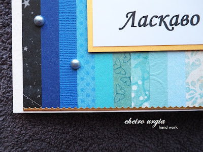

Since the card still seemed to be missing something, I had a look at my embellishments. I didn't want to add flowers or butterflies on it, since I wanted the entire focus on that colour gradient. However, I picked a couple of blue and yellow pearls and placed them randomly across the colourful background. I like the 3D effect they create, and I especially like that I managed to use those huge pearls which usually remain in my stash after I use the smaller ones. I hardly ever create projects that would require the big pearls, but I think they came handy in this one. 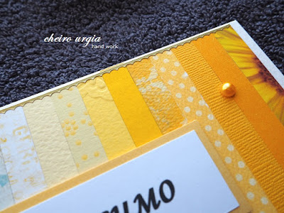

challenges:
- krafty chicks: all occasions- 613 avenue create: ATG
- a place to start: ATG
- a place to start: ATG
- as you like it: feminine or masculine (I definitely create more female projects, but I think I'd still say that I prefer male ones as they're more of a challenge to me. When I need some time off to relax, I'll usually end up making something girly, however, creating something for a man is like a brain tease to me: is that paper OK or should I keep looking for something better? Would that be too much of an embellishment? How many flowers are acceptable, and how many pearls are too many? I'll never ask myself these questions when creating for a female, and I need challenges like this to keep krafting interesting.)
- classicdesignchallenge: ATG DT
- crafty calendar: ATG
- crafty catz: ATG
- crafty catz: ATG
- creative inspirations: masculine
- creative moments: ATG
- creative moments: ATG
- fabnfunky: summer colours
- morgans artworld: ATG
- moving along with the times: masculine/father's day
- path of positivity: ATG with optional twist "celebrate something special about your hero" (I'll not go with a specific hero in my mind here, but the heroism of the Ukrainian people in general - yes, the war may have disappeared from the front pages, but people are still defending their land and their freedom, dying on the front lines, having their homes destroyed and their loved ones killed, being internally displaced or living the life of refugees somewhere in Europe... I can not begin to imagine what the people of Ukraine are going through, and I truly wish they'll be given every form of support they need to preserve their country and rebuild it so it can prosper again.)
- pennys papertake: ATG
- through the craftroom door: ATG
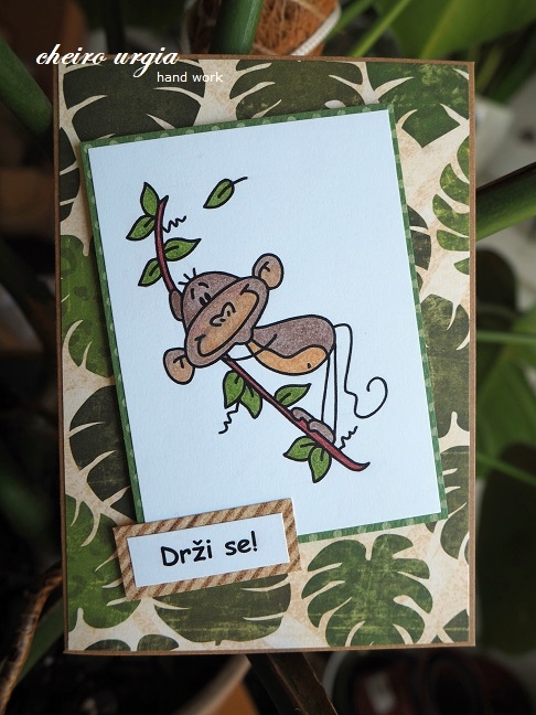
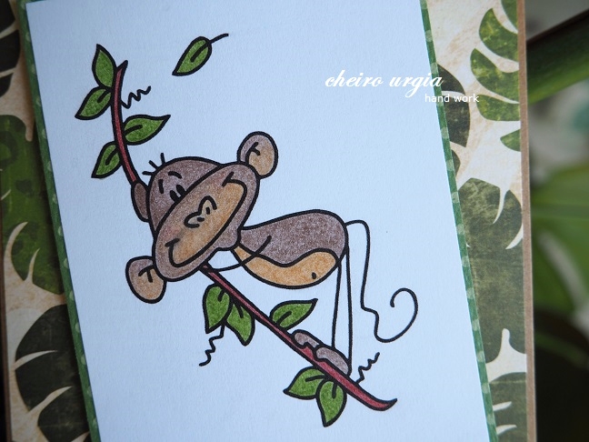
- vesela hiska: rectangle
- wortartwednesday: ATG
- worldwide open design team challenge: ATG
- wortartwednesday: ATG
- worldwide open design team challenge: ATG