
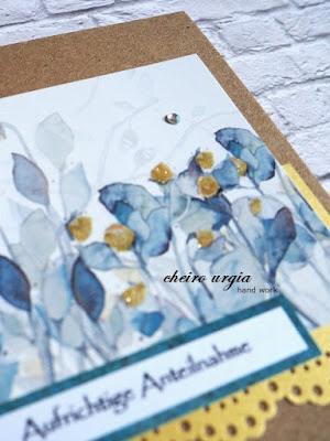
I cut a piece wide enough to be featurred on a card base, but since the floral motif interfered with other stuff, it wasn't quite tall enough for me. To make it appear bigger, I added a punched strip of golden paper which goes with the golden dots of the image. I wasn't sure whether the finished card would be suitable for a masculine occasion or a short "just because" note, but in the end I decided to use it for a sympathy card - the main reason being that the motif looks so serene to me. I then added a small sentiment on dark turquoise paper, and couldn't resist adding a couple of rhinestons in the end.
 I'm not entirely sure whether the outcome is appropriate for a sympathy card, but I like to believe that somebody will like to have one that is not entirely black & white. I try to tell myself that the golden accents are quite discrete, and the gemstones are almost invisible as if they would resemble fireflies above a meadow on a warm summer evening...
 ... but I'd really like to hear your thoughts on this one. Would you think of making a sympathy card like this? Would you buy it if you saw it in the store? How would you feel about receiving a bit of gold and glitter on a sad occasion?


challenges:
- krafty chicks: all occasions
- krafty chicks: all occasions
- 613 avenue create: ATG
- a place to start: ATG
- a place to start: ATG
- allsorts challengeblog: ATG
- C.R.A.F.T.: ATG
- classicdesignchallenge: ATG DT
- crafty calendar: ATG
- creative moments: ATG
- morgans artworld: ATG
- moving along with the times: ATG
- moving along with the times: ATG
- through the craftroom door: ATG
- wortartwednesday: ATG
- worldwide open design team challenge: ATG
- worldwide open design team challenge: ATG

