15 July, 2022

Holidays

Hello and welcome to the newest challenge over at the Alphabet challenge blog!
I'm your challenge host this fortnight, and I'd like to see your "Holidays" themed creations. What kind of holidays, you may ask? That's entirely up to you. If you have a look at the DT creations, you'll see plenty of inspirations to get you started: it could be the classical Christmas holidays (or any festive holidays), or holidays in terms of vacations (again, any season is welcome). I can't wait to see what you'll come up with. Before we start, however, let's have a look at my creation.
I've postponed making my DT inspiration for ages thinking I'd still have plenty of time - which I had before I ran out if it. A crafter's classic, I know. Right before heading home for a couple of days, I realized that I better get my DT task done as long as I have access to my crafting corner. And so I went to work - only that I couldn't decide what to do. I figured I'd make a summer-inspired card and even prepared two layouts, but since they both would feature paper embroidery they'd be very time consuming. Given that I had literally no time left, I had to come up with something else.
I put the embroidery patterns aside and started looking for alternatives. In the end, I thought a summer tag could do the trick. I took this wavy patterned paper from my stash and cut it to the right size for a kraft tag base. I then searched for things to complement the waves. I found it in form of a napkin with small seaside motifs. Among umbrellas, lighthouses and seagulls it also featured a couple of boats and starfish. I cut them out and placed them onto a white piece of cardboard using decoupage glue. Once the pieces were dry, I carefully cut them out again to place them onto the tag. The boat was an easy one, but I managed to tear one of the starfish while doing decoupage, which is why I had to arrange them in a way that would hide the issue. I decided to go with 3D pads and cover my mistake by placing one starfish above the other. Once that was done, I glued a white piece of paper on the back side of my tag. I wrote a dedication by using silver stickers, and after adding a rather thick twine, the tag was done. 
I've been thinking about placing it onto a card base and adding a couple of blue rhinestones around it in order to create a CAS maritime card, but I'm not entirely sure about it. I think it wouldn't look bad, and it would not hurt to sacrifice the back as it's almost empty anyway, but maybe it's good to have some non-card projects at hand just in case. What would you suggest?

challenges:
- craft-alnica: summer
- crafty catz: ATG
- creative crafty uncles: ATG but a card
- creative inspirations: summer sun
- creative moments: ATG
- critter crazy: ATG animals (starfish)
- double D challenges: creatures in/under the sea (starfish)
- everybody art: sunny greetings
- fabnfunky: whatever the weather
- friendship challenge: summer, sun, beach

12 July, 2022

All the best

Another piece of calendar craft for the craft-alnica challenge. I like the combination of green and pink that comes from my 2021 calendar, and decided to use a prominent floral pattern in my card. From a calendar page, I've picked a detail that was particularly colourful and placed it onto a kraft card base. After that, I put the card aside as I simply didn't know what to do. I found it hard to cover this beautiful vibrant jungle background with another motif, and couldn't pick a centerpiece to go with it even if I wanted to.
After a while, I figured I could use it as a frame by placing some paper embroidery in the middle, but I soon realized it would be too much of everything if I followed through with my plan. Instead, I opted for a simple sentiment that could be translated with "All the best". I decided to use a huge font to make it stand out, but at the same time I made sure to leave enough white space all around. Once I cut it to the right size, I took a piece of soft pink card board from my stash. It's a bit different from the pinks in the background, but I think it still creates a nice connection between text and pattern. 
I placed the sentiment onto 3D pads to make it stand out, and I think I really like the end result. 

challenges: 

Sympathy II

Another post, another sympathy card, another entry for the craft-alnica challenge. I worked with paper from an old calendar this time, and unlike magazine pictures which catch my eyes randomly, I'll usually put more forethought into calendar motifs. Every year, I'll pick the calendar that features the most re-usable pictures, meaning they'll not only look nice on my wall, but also later whan I'll dismantle the pages of past year to turn them into something new. 

This particular piece of paper comes from 2021. I've picked a calendar with abstract plant motifs for that year, and I've already prepared a few to be featurred on my cards. For this quick card, I decided to take a piece of a jungle scene. There aren't many leafs on the picture, but I like the way they're arranged. I placed the motif on a kraft card base, added a sentiment on green background paper and placed it onto the card using 3D adhesive pads. In the end, I added two green rhinestones. 
Other than that, there's nothing to say about the card except that I like the green shades it features. I truly believe that sympathy cards don't have to be all black, and I will in fact always look for ways to add a little colour - not too much, but still something that brings a bit of life into a dark time.

challenges: 
- craft-alnica: magazine/calendar paper
- crafty catz: ATG
- inkspirational: favourite colour in monochrome
- love to craft: ATG 
- male room: monochrome

Sympathy

Just a quick card to meet the deadline over at craft-alnica. I'm using plenty of recycling in my projects usually, among others I'll often reuse papers from calendars and magazines. However, I didn't have anything on hand for their current challenge, meaning I had a little crafting session yesterday afternoon. 

After a search through my stash I decided to use a magazine page that I had put aside quite a while ago. It's from a magazine featuring traditional dirndl dresses with a modern touch - neither is my style exactly, but I kept a couple of pictures that I thought might come handy some day. I've decided to go with this rather dark image which is a close-up photograph of embroidery. I thought the earthy tones would be perfect for a masculine card, or maybe a sympathy card, and that's what I intended to do. After long consideration, I went with the latter.
I took the full-page photography and picked a piece of pattern that caught my eyes. After cutting it from the magazine, I placed it onto a kraft card base. I kept the design rather simple as I really wanted to show the pattern in the photograph, which is why I decided to add only a simple sentiment. I printed it on white paper which I glued onto a piece of brown card board. Once that was done, I placed the sentiment on the card, and that's basically it. 

challenges:

01 July, 2022

Fried chicken

How are y'all dealing with the summer heat? I'm having my blinds down all day and only open my windows after midnight, and still start my days with 27 °C in my apartment. I wouldn't activate the AC even if I had one so I don't miss it at all, but there isn't much I can do about the heat than run around in underwear, or rather, try to not move at all if not necessary. Phew!
I'm not sure how this cute Bugaboo chick is dealing with the heat given that it has a feather dress, but it seems to me that it's enjoying life to the fullest. The digi I've worked with is from Bugaboo, unmistakable. As it's such a badass image, I decided to add as little embellishments as possible. In fact, I've just coloured the digi with coloured pencils, and mounted it atop a kraft card base. I'm thinking about adding a few sequins, or maybe a sentiment, but as the card has no recipient yet, I'll leave it like that for the moment. Just being a fried chicken sipping cocktails on the beach - what more could one wish for? 
The chick is a perfect summer motif, and a fun one, too, which is why the card is my DT inspiration for the newest challenge over at the Alphabet challenge blog. We're at the letter G currently, and looking for "Giggles", meaning we'd like to see your humorous creations this fortnight. Share some fun with us and I'll be happy to have a look at your projects!

challenges:
- krafty chicks: ATG
- basteltraum: things with wings
- crafty calendar: ATG 
- crafty catz: ATG
- double D challenges: beach time
- fabnfunky: summer colours
- friendship challenge: summer, sun, beach
- love to craft: ATG 
- make my monday: colouring (coloured pencils)
- traumfabrik: Spring breakdown (beach, party, drinks, fun, zesty colours)

24 June, 2022

Ukraine inspired

I've been crafting in blue and yellow again, creating another card to go with a care package for a Ukrainian refugee. I worked on a gender neutral card from the beginning, as I didn't know whether I'd place it in a male or female box of everyday items. In the end, I decided to send it to a man, but first things first.
My main inspiration for the card came from "Чорнобаївка" - a song by the Ukrainian band Spiv Brativ that was published during the first weeks of the war. Or rather, in the video accompanying it. What sounds strange at first refers to a small sequence of the video that features blue and yellow waves in the background, creating a nice transition of Ukrainian colours. Upon seeing them, I immediately thought about recreating those waves in form of paper strips in order to make a card similar to said background. 
Said and done: I took every blue and yellow paper from my stash, sorting them by shade and pattern to see how many I can find. Since I wanted each strip to be visible, I figured they should measure around 1 cm in width. I then removed papers that looked very similar, but still had plenty of choice, meaning I'd have to expand my card base from a regular one to slimline. Still, I had to remove some more sheets until I ended up with 10 blues and 10 yellows. Their range goes from very dark to very light, and features patterned papers as well as monochrome ones, plain ones and embossed ones. 
Once I managed to align the papers, I cut a 1 cm wide piece of each sheet, which would basically create a transition that goes from one side of my slimline card to the other, with a bit of white card base on each end. When it came to gluing the pieces on the card base, my project became a mess. I thought I'd help myself by holding the pieces in place by using scotch tape, pla
cing it across the front side of my gradient sketch in order to remove them one by one as I would be proceeding with my card. 
However, I picked the wrong one from my dresser, meaning: what I thought was removable scotch tape, turned out to be the adhesive one. Ooops! And I couldn't just use the other side of the stripes as some of the papers had different patterns on the back, which would mess with my idea of a gradient. Silly me! I managed to get the pieces off in the end, but it resulted in a couple of tears, which is why I had to replace a few stripes. Once that was done, I fixed the stripes again, using removable scotch tape. From there on, my work was a piece of cake: I placed the stripes on my slimline card base one by one, and when that was done, I added a printed sentiment saying "Welcome" in the middle of my creation using 3D pads. 
I've picked quite a prominent size for the message, but I had to make sure this square will be able to compete with the ones in the background. To enhance the sentiment, I placed it on a piece of golden cardboard. I think gold in this case creates a nice connection between blue and yellow, without putting too much emphasis on the yellow side even though it's very similar to the yellow shades. Also, I think it adds a bit of elegance because, well, it's gold. 
On the other hand, the golden stickers on the upper and lower edge of the card were added out of necessity: Even though I made sure to cut all stripes in the same width and length, some ended up being a bit longer than others. We're talking about fractions of a millimeter here, but enough to create a bit of up-and-down which irritated me. To create an even line, I covered those ends with a tiny golden sticker - tiny enough to go basically unnoticed, but effective enough to get rid of the nuisance I had with the strips. 
Since the card still seemed to be missing something, I had a look at my embellishments. I didn't want to add flowers or butterflies on it, since I wanted the entire focus on that colour gradient. However, I picked a couple of blue and yellow pearls and placed them randomly across the colourful background. I like the 3D effect they create, and I especially like that I managed to use those huge pearls which usually remain in my stash after I use the smaller ones. I hardly ever create projects that would require the big pearls, but I think they came handy in this one. 

challenges: 
- krafty chicks: all occasions
- as you like it: feminine or masculine (I definitely create more female projects, but I think I'd still say that I prefer male ones as they're more of a challenge to me. When I need some time off to relax, I'll usually end up making something girly, however, creating something for a man is like a brain tease to me: is that paper OK or should I keep looking for something better? Would that be too much of an embellishment? How many flowers are acceptable, and how many pearls are too many? I'll never ask myself these questions when creating for a female, and I need challenges like this to keep krafting interesting.)
- crafty calendar: ATG 
- crafty catz: ATG
- fabnfunky: summer colours
- moving along with the times: masculine/father's day
- path of positivity: ATG with optional twist "celebrate something special about your hero" (I'll not go with a specific hero in my mind here, but the heroism of the Ukrainian people in general - yes, the war may have disappeared from the front pages, but people are still defending their land and their freedom, dying on the front lines, having their homes destroyed and their loved ones killed, being internally displaced or living the life of refugees somewhere in Europe... I can not begin to imagine what the people of Ukraine are going through, and I truly wish they'll be given every form of support they need to preserve their country and rebuild it so it can prosper again.)
- pennys papertake: ATG

17 June, 2022

Friendship

Another Friday, another challenge over at the Alphabet challenge blog. Our theme this fortnight is "Friendship", which should be an easy task for you to play along. And since I'm sure you'll come up with tons of ideas, I'll come straight to the point with my DT inspiration.
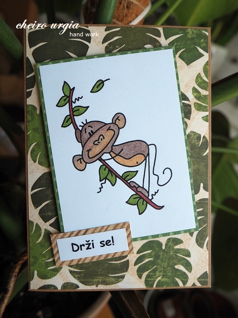
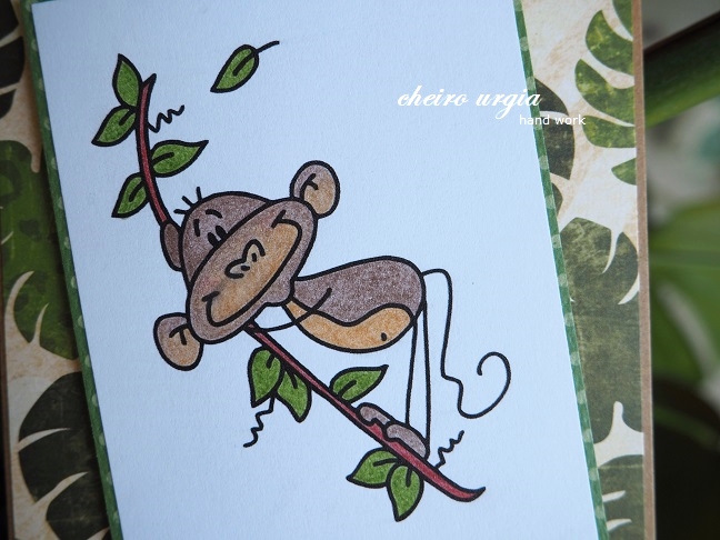
I created a simple "Just because" card for my friend during her internship - a little reminder to take a breath and hold on during tough days and endless nights in the hospital. 
If the card seems familiar to you, it might as well be because you've kind of seen it before. The thing is, I wasn't planning on repeating myself, but since I entered the speed humour challenge back then, one of the requirements was to create something in under 10 minutes. However, I forgot to use the timer while making my first card - oops! The only way to find out how long it took me to create it was to create an identical card and keep an eye on the clock this time. Turns out I'd end up way above 10 minutes, which I mostly attribute to the colouring. But, hey, I got an extra card out of it!
Since I didn't want to end up with two identical cards, I opted for a little difference this time: instead of English, I printed a Slovene sentiment saying "Hold on". 

challenges: 
- crafty calendar: ATG 
- crafty catz: ATG with optional twist "add a sentiment"
- inkspirational: use a digital element (digi)
- little red wagon: digital element (digi)
- morgans artworld: ATG
- moving along with the times: masculine/father's day
- pennys papertake: ATG