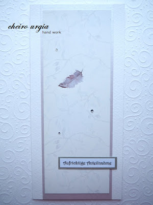
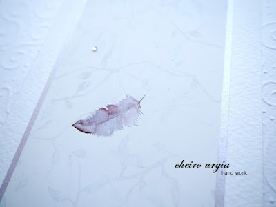
I knew that my challenge would be placed in the winter/Christmas time, but nevertheless, I decided to create a sympathy card. Or rather: I saw this motif of a falling feather on the cover of one of my scrapbook albums, and as I went along with it, this sympathy card happened. I didn't want to throw this beautiful motif away, so I carefully extracted it from the album cover. However, after I removed all the words, it ended up being this weird size - too narrow for a regular card base, and too small for a slimline. I solved the issue by adding an additional layer of light lilac paper. It doesn't show very well in the pictures, but the lilac colour goes well with the feather, and the lilac paper itself has a subtle shimmer.
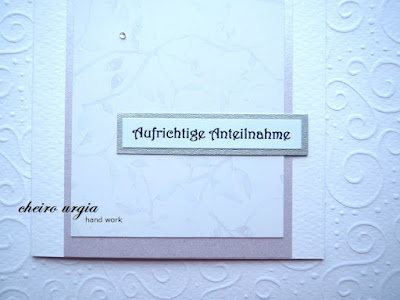
Since the feather is quite high on the card, I decided to surround it by a couple of tiny gemstones. Then I placed a sentiment in the lower part of the card base. I worked with a simple condolence message which I framed with a tiny piece of silver shimmering paper.
What do you think of the result? Shimmer might be a weird flex on a sympathy card, but I thought it would complement the motif of a feather, which was the main reason why I used the paper in the first place. I understand that not everybody might be comfortable with a shimmering condolence card, but I thought there might be people who like it. Also, I tried to incorporate the glitz it in a very small amount while leaving lots of empty space in my card, so that the main focus would be on the falling feather, the subtle branches in the background, and the emptiness that remains when somebody passes away.
challenges:
- 613 avenue create: ATG
- a place to start: ATG
- a place to start: ATG
- CAS on Friday: greeting card
- classicdesignchallenge: ATG DT
- crafty catz: ATG
- creative inspirations: sparkle
- creative moments: ATG
- creative moments: ATG
- little red wagon: glitter
- love to craft: ATG
- morgans artworld: ATG
- pennys papertake: ATG
- through the craftroom door: ATG
- wortartwednesday: ATG
- worldwide open design team challenge: ATG
- worldwide open design team challenge: ATG


That is so beautiful in it's simplicity, Veronika! Thanks for giving us such a great theme this time round
ReplyDeleteThis is gorgeous. Love the falling feather idea. So creative. Thank you for joining us over at Penny's Challenge. Best of luck, DT~Jana Forrest
ReplyDeleteGreat card! Those gems are the perfect touch. Thanks for joining us at Little Red Wagon.
ReplyDeleteBeautiful CAS Design! Thanks for sharing at A Place to Start!
ReplyDeleteHugz,
Chana
Beautiful CAS card! Thank you for joining us at CAS on Friday. xx Wilma
ReplyDeleteso pretty. Awesome card. So glad you shared over at Crafty Catz.
ReplyDeleteVery beautiful. Thanks for joining the challenge of Morgans Artworld. Hope to see you again. Greetings Helma DT
ReplyDeleteYou have made a beautiful creation. Thank you for participating in the challenge of Morgan's Artworld. Greetings Helma DT
ReplyDeleteFabulous creation! Thank you for sharing with us over at Morgan's ArtWorld.
ReplyDelete~ Judy CT
A beautiful elegant card Cheiro! Thanks so much for sharing at Love to Craft. :)
ReplyDelete