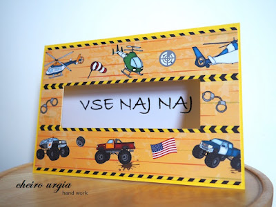
For my DT inspiration, I've worked on something very simple: a birthday card for a young vehicle enthusiast. You certainly know the patterned paper as I've used it in a couple of masculine projects already, and this one is actually a leftover piece. I've cut out the motif of cars in the middle to use them for one of my bookmarks. I figured I'd fill the emptiness with a greeting or sentiment to create an extra card (I didn't want to create any more bookmarks), which is why I placed the patterned paper onto a bright yellow card base. However, I always thought about placing a sentiment over the yellow gap in the middle. This way, whatever I'd place atop that base would have to be rather big, possibly interfering with all the vehicles in the background and making them look inaproppriately small. Since I couldn't come up with anything better, I put my half-finished project aside. I came across it every now and then, and each time it ended up annoying me because I just couldn't come up with a solution. Until I decided to completely change my thought process.
Only a couple of days ago it struck me that I don't necessarily need to cover up the awkward gap - I could make it the centerpiece of my creation! I rearranged the sentiment from my recent summer card and cut it to the right size to match the card base. I then removed the piece of yellow card base that was acting as a gap-holder the entire time, creating an opening instead.
See, instead of putting the greeting atop my card, I decided to place it inside, and I think it gives such an unexpected twist to the original outline. I actually like how everything turned out, and how it all was possible because I changed my way of thinking by looking for the exact opposite of what I had in mind before. A concept that might as well be useful in everyday life.
challenges:
- 613 avenue create: ATG
- a place to start: ATG
- a place to start: ATG
- allsorts challengeblog: ATG
- crafty calendar: ATG
- love to craft: ATG
- morgans artworld: ATG
- moving along with the times: ATG
- moving along with the times: ATG
- pennys papertake: ATG
- through the craftroom door: ATG
- wortartwednesday: ATG


A lovely card for a young boy, thank you for entering our challenge at Allsorts this week.
ReplyDeleteLorraine
A very fun window card! Thank you for joining the challenge at Allsorts.
ReplyDeleteWhat a fun design for a youngster, many thanks for sharing with us at Allsorts challenge.
ReplyDeleteB x
Awesome card and a great idea to make the sentiment as the centerpiece of the card, it's something different and original and perfect to contrast with that bright background and the paper you've chosen. Thanks for joining us at A Place To Start. Hugs, María.
ReplyDeleteNice work. thank you for sharing with us over at Morgan's ArtWorld. Love to see you again.
ReplyDeleteIne DT
http://creaine-cards.blogspot.nl/
owner: http://mixedmedialovers.blogspot.com
Fantastic card well done. Thank you for sharing your creation with us over at 613 Avenue Create and we would love to see you in our future challenges
ReplyDeleteElaine DT
AAA Birthday DT
Mix it UP DT
613 Avenue Create DT
Love to Craft DT
Love to Scrap DT
Peace on Earth DT
Merry Little Christmas DT
Well done on creating a great inventive design to solve the problem you had. It looks wonderful and perfect for a child. Thanks for sharing with us at Allsorts challenge.
ReplyDeleteHi,
ReplyDeletewhat a faulous card and a really lovely design also.
Love the bright colours and the vehicle theme is gorgeous.
Thank you for joining the MAWTT Challenge.
Lots of crafty love. Jenny L. DT
This is so cute! Love the design! Thanks for sharing with us at A Place to Start!
ReplyDeleteHugz,
Chana Malkah, Owner
nice card
ReplyDeleteThank you for joining our challenge
greetings jolanda bongers
dt morgan's art worlds
Cute card for a young man. Thanks for joining the challenge at Love to Craft Challenge Blog.
ReplyDeleteGreat creation! Thank you for sharing with us over at Morgan's ArtWorld.
ReplyDelete~ Sherry CT/Admin/Coordinator xx