25 March, 2022

Zig Zags

I'm a bit late for today's theme reveal as I've had quite a busy day, so I'll keep it short: as the title suggests, we'd like to see "Zig Zags" over at the Alphabet challenge blog - an easy peasy task to finish the alphabet. For my DT project, I decided to show you a little bookmark I've made recently. 
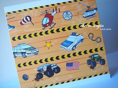
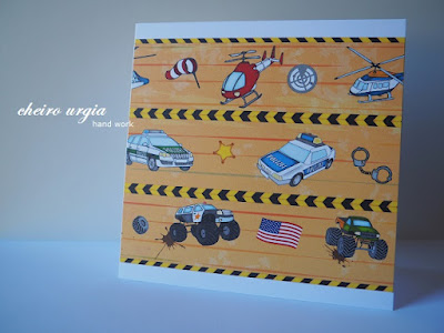
The patterned paper is a leftover from the "Vehicle" challenge in January, and since I enhoyed working on the masculine vehicle card, I thought I might as well use the remaining scraps to create another masculine project. 
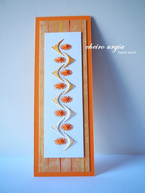
On the other side of the bookmark, I've placed a strip of white paper on which I've stitched a simple geometrical pattern. It's not exactly the classic zig zag, but I hope it qualifies with the challenge theme. 
As you see, the zig zag itself is made of a yarn that changes colour, while the orange dots are constantly the same. I've picked a colour scheme that would match the car paper on the other side, and connected both sides with a strip of orange cardboard. 
I decided against any embellishments because I wanted both motifs to shine on their own. And even though the bookmark has no recepient yet, I vcertainly hope it will encourage a young boy on his journey of reading lots and lots of books.

challenges: 
- krafty chicks: all occasions
- C.R.A.F.T.: ATG
- craft-alnica: male job (policeman)
- crafty catz: ATG
- creative crafty uncles: jobs (policeman)
- love to craft: ATG 
- modsquad: ATG but a card
- pennys papertake: ATG
- sparklesmonthlychallenges: for men only
- through the craftroom door: ATG
- unicorn challengeblog: dots and/or stripes (orange dots in the stitched pattern, stripes on the background paper)

11 March, 2022

Blue and Yellow

We're almost at the end of the alphabet, and we're having another task for you at the Alphabet challenge: Y stands for "your favourite colour combination", which is self-explanatory. Show us which colours are dear to you, and you're on board for this fortnight.

To me, the DT inspiration turned out to be a bit tricky still. Part of the problem is that I don't actually have a particular favourite colour, let alone a colour combination. I'll go with natural colours, but within that range I'm quite flexible in my crafting - meaning I'll be creating based on my mood rather than a specific colour scheme. 
Nevertheless, I've prepared a project originally, and I've done so well ahead of the due date, which is rather unusual for me. But in the last days of February, it all didn't seem to matter anymore. Even with increasing tensions and threats in the past weeks, I never thought the situation in Ukraine would turn into a war. Yes, the rhetorics have been nasty for a while, but the idea of invading a sovereign country, and destroying life and livelihood of its citizens is so beyond anything I can imagine that I've found myself randomly bursting into tears just thinking about the ongoing brutality. And amidst all this madness, Ukrainians have shown an incredible share of courage and determination. It would be impossible to sort my thoughts on what led to the situation getting out of hand, let alone predict the course of events or discuss possible outcomes. All I can say is that I hope the people of Ukraine get all the help they need in the fastest way possible - no matter whether they're running for safety abroad, hiding in their bunkers, or fighting on the front lines.

Anyway, in this horrible, horrible situation, the colour I'd like the world to see is the colour of peace. Not knowing what it looks like, I've opted for the combination of blue and yellow as it can be seen in the Ukrainian flag. When the #CardsForUkraine project came to life, my first thought was this pattern of butterflies. I had no exact image in my mind, but I immediately had this idea in my mind that I could stitch one row of butterflies in blue, and the other one in yellow. Also, butterflies seemed fitting to me because of everything they resemble: the fragility of their wings, the hope that comes with the sight of first butterfly after winter, the awakening of spring and life in general, the freedom to fly wherever you please, as well as the idea that the wind can blow you away anytime while you have no place to call home... 
And despite all the ideas, I just couldn't get myself to craft my time away while the world was falling apart. Finally one day, I had a look at my crafting supplies. For yellow, I think I managed to pick the right shade, but for the blue counterpart I had to improvise with a yarn that has different shades of blue. It may not be correct in the sense of heraldics, but I feel like this gives a bit of depth to the simple motif. Once the stitching was done, I added tiny brown pearls in an attempt to bring the butterflies to life.
Then, I placed them onto a strip of yellow cardboard, which I then mounted on a white background using 3D pads. Before placing the stitched motif onto my card, I had to verify the correct lineup of the Ukrainian colours in vertical position. I know that horizontally blue comes above yellow, but I wanted to make sure the colours would be displayed correctly - especially since I somehow like the vertical version of the card better, and this is how I imagined my card in the first place.
The white background has an embossed pattern which is barely visible, but I like to believe that it gives a nice touch to the card as a plain white surface would be a bit too plain. I can't remember the source of the white paper, but I think it comes from an old calendar, or maybe an old book?
For the card base, I opted for a kraft paper, which gives the card an earthy touch, and also matches the brown in he butterflies.

Next to crafting blockade, I've also had some issues following the unfolding events. I wouldn't consider myself "old school" by any means, but the idea that we're basically able to follow a war on live feed is probably one of the most bizarre things modern technology has brought. I'm having a hard time wrapping my head around the idea that we're being updated on things as they happen, with all the positive and negative effects this brings. At some point, you end up clinging onto the internet for updates, while you'd like to hide in a cave at the same time just to get away from the latest breaking news. In the end, it's nerve-wracking to browse the internet at all, because updates are literally being shoved down your throat. 
As often, Ive found a bit of an escape in music, namely in the heavenly tunes that come from the Ukrainian folk instrument bandura. I figured I'll share some here in hope it might help you to balance yout internet intake and not drown in your own thoughts. 

challenges: 
- 613 avenue create: ATG
- a bit more time to craft: ATG
- a place to start: ATG with optional twist "two by two"
- as you like it: favourite interactive or not (I prefer non-interactive cards as I feel like they give me more artistic freedom, especially as I don't usually plan exactly how my cards are going to look like. Non-interactive projects allow me to focus entirely on whatever will unfold in front of me, as well as change things if I feel like it, while an interactive card will usually require more planning in order to make sure the elements line up in the correct way, with less flexibility for changes.)
- colorhues: blue & yellow
- crafty catz: ATG with optional twist "colours of spring"
- everybody art: something with "B" (blue, butterflies)
- modsquad: standing with Ukraine
- morgans artworld: ATG
- my time to craft: animals
- pennys papertake: ATG
- traumfabrik: a bug's life (butterflies)

25 February, 2022

Polka dot angel

Did you know there are around 400 words in the Oxford English Dictionary that start with the letter "X", while about 120 of them are actually being used in everyday language according to lexico.com? I learned the hard way when I had to pick a theme for the upcoming challenge at the Alphabet challenge blog. As I wanted to make sure the word prompt will give you a bit of creative freedom, I opted for "Xanthic", which defines as follows: "of, relating to, or tending toward a yellow colour".
Meaning, you can play along in the Alphabet wheel this fortnight as long as you feature something yellow on your project - just make sure that yellow is the main colour of your project (or at least a prominent accent), not a single tiny yellow dot, if you know what I mean.
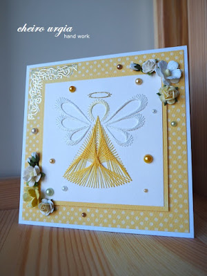
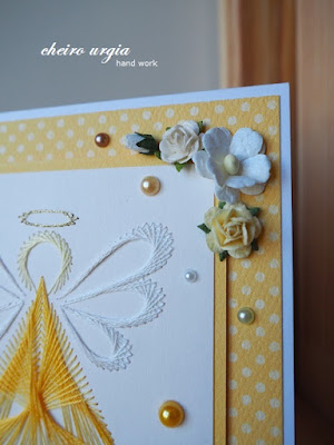
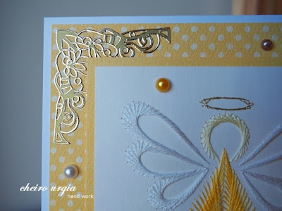
For my DT creation, I thought I'd feature some spring flowers. Daffodils and crocuses came to mind, but in the end, I decided to make something completely different. I took this lovely embroidery pattern of an angel from my stash and pricked a piece of white cardboard accordingly. Then, I used a yellow yarn for the dress, which I complemented with white for the wings, as well as light yellow for the face and gold for the halo. 
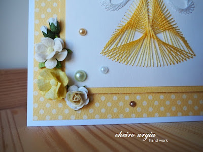
Once the stitching was done, I placed the little angel onto a layer of yellow cardboard. For the background of the card, I used a yellow polka dot paper. To round up the card, I decided to add a few embellishments: at first, I added a couple of paper flowers and a golden sticker that goes in the top left corner. To enhance the polka dots, I then added a couple of pearls in colours that match the colour scheme of the card: yellow, white, light green and brown.
The lower right corner may seem to be forgotten, but I left it empty intentionally because the card has no recipient yet. In case a sentiment (or a name) will be needed, I'll be able to add it in that corner. On the other hand, I like the card as it is now so I might as well leave the card as it is now.
For the moment, I'll just hope that the little angel can spread his wings and bring a sense of safety to those who need it most while being faced with war and destruction. And maybe, even a bit of commom sense to grown up men who behave worse than any toddler having a temper tantrum?

challenges:
- krafty chicks: all occasions
- as you like it: favourite occasion (I mostly create "just because" cards since I believe you don't always need an official occasion to let somebody know that you're thinking of them. They also give me the greatest artistic freedom because I can pick whatever motif/colour/style I feel like creating in that particular moment.)
- cards4galz: things with wings
- crafty calendar: ATG
- crafty catz: ATG with optional twist "add flowers"
- craftyhazelnutspatternedpaper
- little red wagon: make it stitched

19 February, 2022

White stars

I can't remember the last time I walked through a winter forest, admiring the first spring flowers. Partly, I still need to distribute my daily time and energy wisely in order to not overstrain myself. On the other hand, I just prefer to stay away from people - more so now as the restrictions loosen or don't seem to be followed in the first place. This one technically wasn't a walk either, just a drive on a forest road with mom, but we stopped at the sight of snow roses. Many of them are in full bloom already, and look like white stars on the bald forest floor. 
Between sunshine and clouds, I managed to pick a couple of buds that we later dropped off at mom's elderly aunt. The forest isn't far away from her home, but since she isn't able to get there anymore, I allowed myself to bring a bit of spring in her direction. The only little vase she had available is one with winter ornaments, but since they're almost covered with greenery, it doesn't disturb the overall image. 
A contribution to the Friday Flowerday at Holunderbluetchen.

11 February, 2022

Winter

Welcome to a rather long post from me today, and in order to keep it as compact as possible, let's get straight to the point by saying: Winter is here!
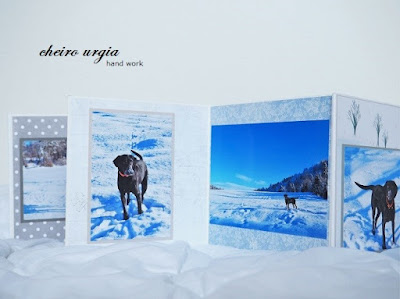
Not the actual season though, as the first spring flowers are already in full bloom. No, "Winter" is our theme at the Alphabet challenge blog this fortnight. For my DT inspiration I prepared a little photo album, but let's start at the beginning...

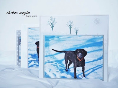
A family friend has lost her dog in a stupid car accident in the end of last fall, and naturally she was devastated. We don't visit as often as we used to due to health and family issues on both sides, but we would go for short walks every now and then with her furry companion. On one of those walks in the beginning of last year, I managed to get a couple of nice pictures of her dog, which I intended to turn into an album at some point. I've never created anything like that before, so I postponed over and over again. With Christmas approaching, I thought I might give it a try at last and create a Christmas present, a booklet featuring the best shots for her to have as a rememberance of that beautiful winter day we had together. The ideas I had in my mind were still very vague - until she called one day to say the dog was gone. The gift was never meant to be a memory of a lost dog, but here we go. 
I began to prepare everything I'd need, selecting the pictures and the papers that would go with them. Once that was done, I needed to come up with a way to print the photos. With a very spirited dog, most of the pictures needed to be cut and/or cropped, which would be quite inconvenient  to be printed at the local photographer. Instead, once I figured out the ideal size of each picture, I decided to make a quick pre-print on scrap paper using my home printer. I then made a few more adjustments, and later printed the pictures on photo-paper that came with the printer. I never thought I'd use those sheets and almost threw them away recently. Yay for all the crafting hamsters who believe everything *might* be useful one day!
Once the printing was done, I cut each photo to the right size, and started placing them onto different sheets of patterned paper. Most of them come from a winter collection (which matches the walk through winter wonderland), but I've also added some random sheets from my stash. 
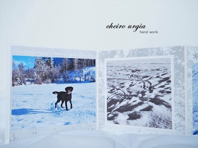
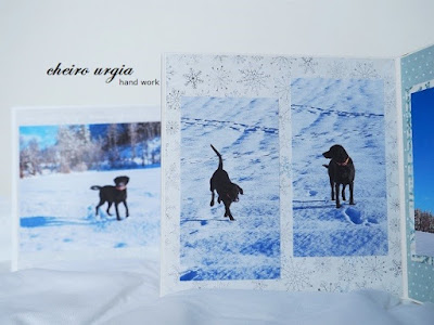
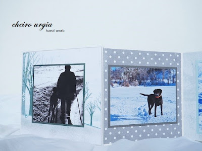
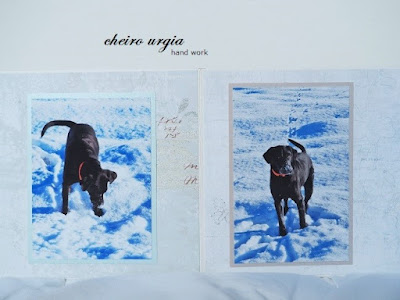
There are 12 album pages in total, and I won't go into detail about every single one as the pictures speak for themselves. What they all have in comon is that I decided to present the photo as an eye-catcher, meaning the background papers would be mostly pastel shades with minimal pattern. Among the dog shots I'd place a few landscapes to fully sum up the beautiful sunny day. As you see, most of the photos are in original colour, but I edited some to be black & white, which seemed suitable for the last picture especially.
The album starts with an excited dog face and ends with the two walking towards the afternoon sun. Between are different scenes of him playing in the snow, running around or just waiting for the next command (which he wouldn't follow anyway). 
I contemplated adding embellishments for quite some time: a few silver stickers here, a punched border there, maybe a couple of pearls, a piece of lace or ribbon, a wooden snowflake or a few paper flowers... In the end, I decided to go without. On the one hand, I was afraid of making the album too thick and difficult to handle, on the other hand, I didn't want to take attention from the main motif(s). The only shimmer I incorporated can be found on the background papers in form of glitter snowflakes and silver swirls - enough to melt with the shiny snow in the pictures, but still discreet enough to blend in with the scenery.

Once I was done, I struggled to get the optimal light conditions to document my project. I did the best I could on a relatively sunny winter day, to no avail. This is the best I could come up with, but let me tell you that in reality the album is really bright with white and blue shades that are not leaning towards a cold, blue-ish pallete. 
In the very end, I wrapped the album already as I meant to stop by her house, only to learn that our friend ended up in the ER due to a bad fall & fracture. Fortunately, she managed to alert family, but she had to spend quite some time in the hospital meaning I couldn't deliver the gift personally due to visitor restrictions. However, I managed to drop the album off at the reception who organised for the album to be brought to her room. Later, I learned it arrived safely, and I was more than happy to hear the gift was well received.  

challenges: 
- 613 avenue create: ATG
- a bit more time to craft: ATG
- a place to start: ATG with optional twist "add a critter"
- as you like it: true love or fabulous friendship (apart from creations I do just for fun, I'll mostly design for friends & family as I feel like it gives me a broader spectrum of motifs to work with. Love is too often reduced to red roses and hearts, while crafting for friends gives me more artistic freedom to work around their favourite things and patsimes.)
- love to craft: ATG 

28 January, 2022

V for Vehicle

We're slowly approaching the end of the alphabet, and our newest challenge over at the Alphabet challenge blog is "Vehicle". It's as simple as that, you may link up any of your creations given it features a vehicle. As always, the DT has prepared quite diverse inspirations to help you in case you're stuck with the theme this fortnight. 
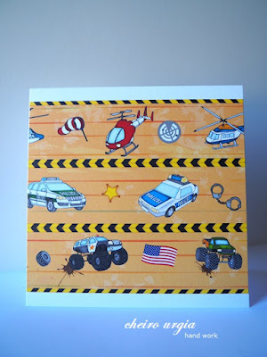
For a moment, I thought about re-using my love truck digi, but I think I'd create a project very similar to the one I've done for an Alphabet challenge almost a year ago. Instead, I opted for a piece of patterned paper I've bought a couple of years ago. I'd usually never get something like this for myself, but I thought it might come handy for a masculine project, even for a kid. And since I'm not that good with crafts for boys, I like to have a sortiment of "boys stuff" to use if needed. 
Since the motif of vehicles is literally all over the place, I decided to just cut a piece that would fit onto a plain white card base. No sentiment, no embellishments. I'm not sure whether it counts as a CAS design since the paper itself is quite playful, but I don't really feel like the card needs anything else at the moment.
There is, however, place for a short sentiment at the top or bottom of the card, should it be needed. I can easily imagine a small "Happy birthday" as the card seems perfect for a guy's birthday. The pictures are a bit dark unfortunately. In reality, the paper is a rather bright golden/orange, and the vehicles stand out nicely in their specific colours. 

challenges:

14 January, 2022

Unequal

I'm going to cheat on the current Alphabet challenge and present a project that I've done a while ago. But first, I'd like to present you the challenge theme for this fortnight, which is "Unequal". Show us something big and something small on your creation and you'll be eligible to play along.
I spent the first days of the new year at home and have attempted to bring a bit of order into my apartment, maning I haven't done any major crafting recently. I did prepare for some upcoming challenges, but I just couldn't come up with something unequal. In the end, I decided to bring in this flower pot which I've decorated ages ago using napkin decoupage. 
I'm not sure whether you can tell, but it's a rather large pot and probably the biggest crafting project I've done so far. The backstory to my piece of art is that I once had the brilliant idea of growing my own ginger. The idea didn't come overnight, but in form of a forgotten ginger root that began to sprout on my kitchen counter. I thought why not give it a try and began exploring my options. Starting with a small sized flower box, I soon had to realize that I'd need a bigger pot since ginger roots grow rather horizontally. 
And boy did I go big. Once I brought the grey monstrosity home, I began to think of ways to make it look presentable. Since I didn't want to hand-paint it using acryllic paint, I bought a couple of spray paints. After all, that's what you see being used for almost every upcycle/recycle/alteration over at YouTube. However, I soon realized that my cans won't do. I'm not sure whether it was some kind of "expectation vs. reality" thing, but they seemed to be empty after covering only a small portion of the container, and I made quite a few visits to the crafting store buying can after can until I added enough layers to turn the grey surface white. 

Once that was done, I took the weirdest napkin from my stash: a thing with huge roses alongside with smaller blooms in between. I fussy cut them by a wet brush to tear the napkin apart, and placed them onto the pot using every single bloom there was. I placed the roses first as they'd take up most of the space, and later worked my way around them by distributing the smaller pieces. I managed to create a tear here and there, and there are a couple of wrinkles, too, but overall the decoupage was the easier part here. I tried to document the process in the best way possible, but did I mention that the pot was really huge?
In the end, I placed a layer of grey felt underneath the container to make sure it wouldn't scratch the floor while being moved around.
Then, I filled the pot with soil, placed the ginger root inside and waited for the result. 
Was it successful? The greenery grew quite well in the beginning, but the leaves began to turn brown after some time. I guess I've been too eager with watering since the main root rotted away, but I managed to harvest 2-3 smaller bulbs of new growth. I wouldn't call it a success as such, but it sure was an interesting experience and I might try again one day by being more careful with the plant care. However, I learned that ginger leafs spread the most beautiful fragrance when they grow - and it intensifies when you gently touch them. 

challenges: