29 December, 2023

Texture

In what will probably be the last post of this year, I'd like to introduce you to another challenge over at the Alphabet challenge blog. Our theme for the letter "T" is "texture", which gives you plenty of artistic freedom with your creations. To see what my teammates have prepared for you, please have a look at our inspiration gallery. I for myself decided to make a little tag inspired by good wishes.
On one side, I placed a simple message saying "all the best". I framed it with a piece of red cardboard, and glued it onto a piece of white embossed paper. To emphasize good luck, I added a tiny wooden ladybug in the top corner of the tag.
On the other side, I started with a piece of red background paper, which I complemented with the image of an ambulance from my stash. I think I saved it from a folder once, but I'm not entirely sure as it was literally ages ago. I restrained from any sentiments here, but I did add two star-shaped gemstones that match the colour scheme of my project. This way, I managed to feature a bit of texture on each side of my creation.
I like how the kraft tag goes with both designs, bringing the colours together. Once the tag was done, I took a piece of raffia from my stash to create a ribbon. I'm not sure where my project will end up, but I could imagine it could go well with a chocolate bar as a "get well soon" gift. 
With that in mind, I hope you'll have a wonderful entry to 2024, and may the new year shower you with all the best.

challenges: 

15 December, 2023

Stars

You may have already seen that we have another challenge up over at the Alphabet challenge blog. With the letter S, we'd like to see some stars in your projects. As always, you may interprete the theme as you wish, and I'll be more than happy to have a look at your creations. 
For my DT task, I prepared a stitched project again. I don't do many of those currently as they're quite time consuming, but I thought this geometrical pattern would go nicely with  the star theme. 
I stitched the pattern with a silver yarn, and once that was done, I placed the white cardboard onto a shimmering purple background paper. It may not be obvious as most of the paper is covered, but the motif on the paper is a galaxy of stars. I also like the different shades of purple it features, and in my opinion, the shimmer matches well with the silver stitching. 
For a bit more colour, I then embellished the stitched swirls with different gemstones. First of all, I added the big ones on the outside. Some of them are purple to match the background, but I decided to add some star-shaped gemstones as well to emphasize the challenge theme. I then moved to the inner circles by adding a round of tiny silver gemstones. In the end, I added bits of pink and white to the core. With the sparkly additions, the silver swirls look like the image of a supernova to me, which again connects to "Stars" as the theme of the current challenge.
I hope you can draw some inspiration from my work. If not, feel free to visit our challenge blog to have a look at what my teammates have created for you. 

I will also leave some actual stars to inspire you. I don't really like driving in the night due to poorer visibility, and I especially don't like driving at night in winter when the temperatures sink rapidly after sunset, and there's danger of ice on the road. I will try to avoid night journeys whenever I can, but since it's getting dark pretty early right now, I ended up on a dark road in the middle of nowhere just the other day. However, the middle of nowhere meant that the light disturbance was minimal, and driving above the fog soup that was brewing down in the valley, it meant that the whole sky opened up for me. I could get a glimpse of the starry sky from my car already (despite the headlights!), and I decided to stop by the roadside to take a proper look. In complete darkness, I was stunned by millions and millions of stars above me. I couldn't last long due to the icy wind, but I managed to snap some pictures which don't to justice to reality. 
It was an unexpected but lovely experience, and I can't help feeling sad about not being able to see skies like this more often. Living busy lives in cities, we seem to forget the impact of our lives on the environment, and it's moments like this that make me realize how even regular lights away stunning scenes like this. Of course electricity is what makes our lives easier, it makes it possible for us to be active after sunset, and makes us feel safe on the roads at night, but at the same time, we are missing the magic of nature by blinding ourselves with artificial light. I don't think that we need to turn our world into a dark place, but without a doubt we could cut down on unnecessary brightness: shiny billboards, illuminations of landmarks, shopping windows, and empty hallways outside of business hours... Less electricity for more stars, please.

challenges: 

01 December, 2023

Reindeer

Can you believe it's December already? With  Christmas around the corner, we're having a festive challenge theme over at the Alphabet challenge. Matching the season, we'd like to see reindeer on your creations. Easy peasy, right? 
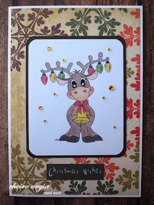
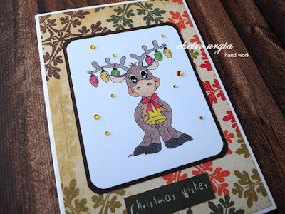
For my DT inspiration, I picked a lovely digi from my stash. I received this cutie a couple of years ago for a challenge win over at the Kreativtanten. It was designed by Peppercus designs, and even though I believe the shop doesn't exist anymore, the little reinder is still adorable. I coloured it with coloured pencils, and decided to frame it with a dark brown background paper. I used a punch to round up the corners of both papers. To cover the card base, I opted for a design paper with bold, colourful snowflakes. To enhance the image a bit, I added a Christmas greeting under the reindeer motif. Unfortunately, it's not very visible on the colourful snowflake background, and its dark green paper looks brighter in reality. 
For a bit of bling, I then added a couple of yellow shimmering gemstones. I thought about shading the background of the image with blue colour pencils, but in the end, I decided against it as I wanted to keep those warm shades on my card. I'm not sure whether this was the right decision as it seems to me like the reindeer is stuck in a white void. What do you think?
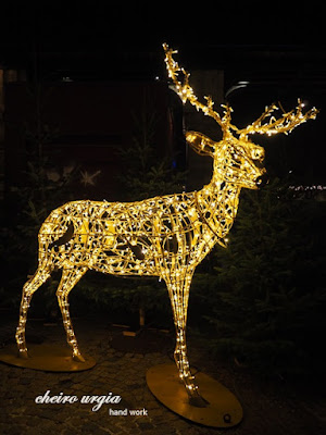
To wrap up my post for today, I'll give you a glimpse of Christmas feeling with this wonderful life size reindeer from the local Christmas market. 

challenges:
krafty chicks: ATG
613 avenue create: ATG
a place to start: ATG with optional twist "for a child"
as you like it: favourite person to craft for at Christmas (I don't really make Christmas cards for my immediate family as we see each other anyway, my favourite person to gift would be my friend. We don't keep in touch as much as we used to as she's working full time now, but I like to send her a surprise every now and then. With two little children in the house, I think this cute little reindeer is the perfect messenger to deliver Christmas greetings.)
C.R.A.F.T.: Christmas
cardz4guyz: festive creatures
CAS on Friday: Christmas
crafty catz: ATG with optional twist "make them smile"
creative inspirations: ATG with optional twist "contemporary Christmas colours"
creative moments: ATG with optional twist "winter"
critter crazy: ATG animals
cutie pie challengeblog: digis & die cuts
friendship challenge: Christmas time
love to craft: ATG 
moving along with the times: winter animals
pennys papertake: ATG paper
scrapping4fun: non-traditional Christmas colours
sparklesmonthlychallenges: winter animals
timeout challenges: winter holiday
traumfabrik: Elliot the littlest reindeer 

19 November, 2023

Quadruple

Better late than never, I'd like to introduce you to the latest task at the Alphabet challenge blog. I've been in the hospital during the past days, and even though I was discharged yesterday already, I took the day off to rest and unwind. 
We've arrived at the tricky part of the Alphabet, but don't worry: our theme for the letter Q is "quadruple shapes or images". Have a look at that the DT has created and play along!
For my inspirational project, I opted for a very CAS card that is way off the current seasonal creations. I took a bugaboo digi from my stash, which couldn't be more perfect for the challenge theme as it featured four squares with different floral motives. Or, to be precise: three floral motives and one saying "Hi". At first, I disassembled the original digi by cutting out the squares to create four individual elements, which I decided to arrange in a single line unlike the original 4 x 4 setup. I then coloured the motifs with coloured pencils. For a long time, I thought about creating a bookmark, but in the end, I opted for a simple "just because" card. I took a kraft card base from my stash, and glued the bugaboo snippets to the card with double-sided adhesive tape. I then replaced the dot above the "Hi" with a tiny wooden ladybug. This way, I'd add a bit of colour to that square, and a bit of 3D feeling to my card. 
I decided against adding a sentiment to make sure the card can be used for different occasions. I even restrained myself from adding pearls and gemstones, to make sure the only pop of colour are those floral squares. I like to think the card turned out OK, but on the other hand, it does look a bit empty and I'm not sure whether I should try to improve it by adding something? What could that "something" possibly be?

challenges: 

03 November, 2023

Peace

After a short break due to family/health issues, I'm back on track with the Alphabet challenge design team. Our theme this fortnight is "Peace", which I'm sure is a heartfelt wish at the moment. You may interprete the theme however you like, and I'm sure we'll get to see many Christmas cards already. If you need a little help to get your fantasy going, you can always have a look at what the DT has prepared for you.

I for myself immediately remembered this embroidery pattern of a dove that I had stored in my crafting folder. It took ages for me to find it, but it was all worth it. It turned out to be even more beautiful than I had in mind, and I immediately went to work with printing the image. Once that was done, I took white cardboard from my stash, and made sure to prick and stitch the motif as instructed. I opted for natural yarns, as I intended to add a bit more colour in the background later. 
To be precise, I picked blue and yellow polka-dot paper from my collection, and cut a piece of each to match the size of my card base. I placed the pieces onto my card to create the Ukrainian flag in honour of everybody who keeps defending the land and its freedom. In the very end, I added a tiny golden sticker to frame the motif of the dove, as well as a tiny gemstone for the eye of the animal.
As shocked as I was almost two years ago when the full-scale invasion began, I'm furious now at the lack of unity and support among world leaders when it comes to providing the Ukrainian defenders with everything they need. The sacrifice of the Ukrainian people deserves the greatest respect, and we should be supporting their fight for lasting peace with everything we have. Who are we to think that shallow words of concern and timid statements of condemnation will stop an agressor who understands nothing but sheer power? I'm sure that a strong and timely response of the democratic world would not only help end this particular war in time, but also prevent the bushfires of violence all around the world, as every autocratic/terror regime would know exactly what awaits them if they start chaos. Turns out peace is neither God-given nor self-evident, and it takes enormous vigilance to make sure we preserve this precious commodity. Oh, well... 
I don't know when peace will come to the people of Ukraine, but I wish so much for a victory, and the return of life to the settlements that have been razed to the ground in this destructive madness. 
With the winter season at our doors, I'm afraid there are difficult months ahead for the people of Ukraine. It might be the right time to look into charities that provide help in form of heating and energy devices that will help the country going through the cold and dark time of the year. 

challenges: 
613 avenue create: ATG
a place to start: ATG with optional twist "all that glitters" (golden sticker, gemstone)
C.R.A.F.T.: ATG
crafty catz: ATG
critter crazy: ATG animals
love to craft: ATG 
pennys papertake: ATG paper

02 November, 2023

Trick or treat

Just a quick post from me today to show you one single Halloween card I made. I'm not really into the spooky holiday as we don't celebrate it, so even if I would create Halloween stuff I couldn't possibly get rid of it. However, I had to try and use this amazing patterned paper from my stash. I'm not sure where I bought it, it might be a paper shop in Pardubice a couple of years ago. 
For my card, I decided to apply a concept I've used before for both a summer, and a Halloween version: a popsicle made of patterned paper, placed against a white embossed background. The green paper with spiderwebs couldn't be more perfect for the spooky season, and if you look closely, you might also find a little spider! I think the paper turned out great with the popsicle design. Matching the ice cream, I placed a green cardboard in the background, as well as a couple of shimmering gemstones onto the embossed piece of paper. For the card base, I used simple kraft paper. 
I'm not sure whether I would eat a creation like this, but on the other hand, I can't help thinking how it would be recreated in real life: a matcha ice cream with dark chocolate maybe? 

challenges:
613 avenue create: ATG with optional twist "fall colours"
a place to start: ATG with optional twist "all that glitters" (gemstones)
allsorts challengeblog: ATG with optional twist "embossing"
basteltraum: autumn mood
C.R.A.F.T.: ATG
- CAS on Friday: animal (spider)
crafty catz: ATG
crafty gals corner: Halloween colours
creative crafty uncles: Halloween (masculine)
critter crazy: ATG animals (spider)
dream valley: autumn colours
fabnfunky: masculine
love to craft: ATG 
pennys papertake: ATG paper
sparklesmonthlychallenges: things that go bump in the night
traumfabrik: Oz the great and powerful

06 October, 2023

Nature

I'm back with another project of mine, and as it's the case on every other Friday, it's my DT project for the Alphabet challenge. Our theme this fortnight is "Nature", which gives you a variety of interpretation, especially as nature begins to put on its most colourful clothing. 
To be perfectly honest, I've created my project quite some time ago, during my last rehabilitation. The crafting hours were a welcome break during all the other therapies, and posed their own little challenge as I couldn't access my crafting supplies back home. Instead, I'd be working with limited supplies and stuff I don't normally use in my crafting corner. 
For this particular project, I picked a canvas which I covered in white acrylic paint. I picked a couple of napkins and other embellishments that might be useful in my project, but I didn't really have a specific idea about what I wanted to achieve. I placed a napkin with the motif of handwriting all over the canvas. Once that was dry, I used diluted acrylic paint and a napkin to drizzle a brown-ish shade above the handwriting. I then added parts of a napkin with a lovely fall scenery: a bird on a branch with berries. I complemented it with some bark I picked on one of my walks, and I think it creates the impression of an old garden fence. I added a bit of "earth" on the lower part of my canvas by using brown acrylic paint, as well as a piece of moss for the grass. 
As the bird seemed so alone and tiny, I created the silhouette of the sun with golden acrylic paint that would shine behind the animal. I thought I was done, but I felt like something was still missing. After giving it more thought, I went back to the crafting room to fill the surface of the sun with brown acrylic paint. I think the sun looks way more complete this way as opposed to an empty golden halo. But it still didn't feel enough. 
I decided to take more golden paint, dilute it with a bit of water, and drizzle it onto the background with a napkin. 
Those golden sparks seemed to bring everything together, but I decided to play around a little more: I took dark green paint and a couple of cotton swabs to add more foliage to the tree branch. My idea behind it was to enhance the leaves that were barely visible on the original motif, and to add more colour to the otherwise brown and gold colour scheme. I'm not sure whether I succeeded to it as those dots seem rather clumsy, but it it what it is. 
When it was time to go home, I decided to not take the image with me as we'd be mooving soon and I knew I'd have no use for it. Instead, a guy friend I met during my stay decided to take it with him. I'm not sure what happened to it in the subsequent months, and I'm not sure what will happen to us, but I discovered once again how mind-blowing it is to spend time with people who just "get it" - the experience of being a young cancer patient, the everyday struggles and frustrations about inadequate care, insurance stuff, friends, family, life plans, and general health issues. Endless discussions without being judged, dismissed, and ridiculed, without holding back and/or not knowing what to say, and without any weird reactions, because everything just makes sense in a weird parallel universe.

challenges:
613 avenue create: ATG with optional twist "fall colours"
a place to start: ATG with optional twist "all that glitters"
crafty catz: ATG with optional twist "colours of autumn"
crafty gals corner: signs of fall
critter crazy: ATG animals
kreativtanten: golden fall
love to craft: ATG 
nachteulen: ATG
unicorn challengeblog: autumn/Halloween
use your stuff: small type (handwriting in the background - not sure if it counts as it's not exactly "words")

22 September, 2023

Monochrome

Hello and welcome to yet another challenge over at the Alphabet challenge blog. With "Monochrome", we have an easy theme this fortnight, meaning we hope to see many of you enter your creations. All you need to do is using one dominant colour in your project. 

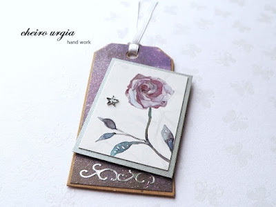
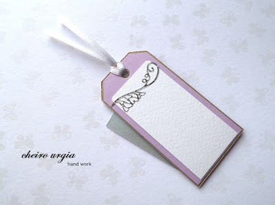
I struggled a lot with picking a colour, because I had quite a few ideas for a pink card... or a red one... or maybe green? Yellow? In the end, I opted for purple - I don't create much in this colour to be honest, but I had this tiny leftover in my stash that I wanted to use for ages. It's the motif of a rose that I cut from an album cover once, and it was way too pretty to throw it away. The rose is printed in a way that makes the surface glossy, giving a magical shine to the motif. In the background, you might notice soft foliage that resembles branches and petals. To me, the association to the motif was something between "Sleeping beauty" and "Beauty and the Beast". To keep the attention on the rose, I decided to create a little tag that would feature  the bloom as the main character. 
I placed the rose onto a silver background paper to enhance the shiny component of my tag. For the background, I picked a purple design paper that actually depicts the starry sky. However, as the stars are rather tiny, it looks just like another shimmering background in a dark shade of purple. For a bit more bling, I added a silver sticker on the bottom of my tag, as well as a star-shaped gemstone next to the rose. 
On the back side of the tag, I used light purple and white paper, which I decorated with another silver sticker. It brings a bit of bling, but still leaves enough space for a name or a message.
In the end, I picked a satin ribbon from my stash. It comes in a very light shade of purple which is almost not visible on the pictures, but I didn't want to bring too much attention to the upper part of the tag anyway, so I'm rather glad that it goes unnoticed. 

challenges: 

09 September, 2023

Inspired by a book

Four years ago, I bought myself a birthday bouquet at the flower market. Matching the late summer/early autumn season, I opted for carnations and dahlias - just like those we used to have in our garden when I was a child. I rewarded myself for a couple of tough years in which I came to terms with the reality of life. I found the German edition of "Terre des hommes" by Antoine de Saint-Exupéry in one of those bookcrossing places you can find in many cities, and I cried my eyes out several times while reading it.
Even though premature menopause is a well-known long-term side effect of childhood cancer treatment, I didn't expect it to come so soon, leaving me without a choice or a possibility to prepare. The sweats I jokingly labeled as "probably menopause" turned out to be just that in retrospect, but since they disappeared quickly, I didn't really give it a second thought - after all, I had no tangible plans for family and/or children yet, so what's the point of bothering about circumstances I can not change? Things turned nasty when it hit me that even if I wanted to, the idea of a classic family would be hard to achieve at best, and super expensive to borderline illegal at worst. It didn't help that Google would randomly come up with ads featuring family planning and/or happy childfree celebrities based on my search for answers - an algorhythm that was both heartbreaking and hilarious at the same time, if you have a dry sense of humour. What really hit me, however, was the mental effect that came with the lack of hormones, resulting in an unexplained tiredness that took over every aspect of my being, as if I have lost the momentum of my life. Being an avid crafter with an unlimited fantasy, it was devastating to see that I could't seem to come up with any idea when I was in my crafting corner, and even the most wonderful crafting supplies didn't spark any reaction at all. Fast forward to finding an amazing Ob/Gyn who managed to fix my hormonal mess, I began to feel like my old self again. I like to believe that being a scientifically thinking person helped a lot, but I certainly wish that I could get the proper treatment sooner, and easier. But then again, I was on the right track finally, just a couple of exams left to finish med school at last, which should be easy peasy a whole ton of studying still, but manageable. 

Or so I thought. Little did I know that only two months after this rather symbolic gift to myself, I would face a second cancer diagnosis, which can be another long-term side effect of childhood cancer treatment.
Being fully at peace with my situation, I intended to embrace the journey as it comes, participating in the hospital routine and the decision-making surrounding my treatment like the med student I am. Thinking I could use my knowledge to professionally discuss my case, and be involved in everything and anything, my hospital stay turned into a never-ending nightmare full of medical gaslighting and mockery. I never thought that patient handling could go from textbook-like talks pre-surgery to absolutely disregarding everything I agreed upon once I was transferred back to the ward following the procedure. I never thought it would be possible for medical staff to treat patients like shit up to the point of denying basic necessities such as food, medication, and a quiet environment to recover after major surgery, not to mention no insight in my files, no access to rehabilitation, and no consideration of my observations and concerns. I've been running things through my head ever since, thinking about whether I could have forseen and/or prevented any of this, with no avail - there's no deeper meaning I could draw from the experience, no feeling of gratitude and blessings, no newly found appreciation of life. 
After an experience that shattered every aspect of trust in a patient-doctor relationship, I'm still struggling to find my identity, find the strength to get my studies done, or the courage to leave for something completely different.

As September is the golden month of childhood cancer awareness, I again took this old book from my shelf: "It's not about the bike - my journey back to life" by Lance Armstrong. Regardless of the controversy surrounding the author (and doping in sports as such), this was the book that helped me sort out many hardships during my teenage years, and ultimately made me pursue a medical degree thinking I would make a difference. 
I like to think that the care for little warriors has improved in the past years, and since more and more children survive, it should be crucial for doctors to understand that some side effects of treatments may appear decades after the initial illness, making long-term follow up care an important aspect of life in those specific individuals, taking into account their complex age-specific needs. In reality, I've only met a few doctors who are ready to understand the issues I'm facing, and unfortunately, most don't even try. I'm tired of repeating my history over and over again, laying everything out, only to be dismissed and belittled. I'm tired of being told there's nothing to worry about when I know that this couldn't be furher from the truth. I'm tired of promises about how the fatigue will go away at some point, when I'm still too exhausted to function on a daily basis. 

I might find my own way back to life eventually, but I'm not there yet.  
I'm not sure whether I'll get myself flowers for this birthday, but I created a simple birthday card featuring different yellow flowers. 
I cut the pictures from a magazine and placed them onto matching green background paper. I then placed them onto a slimline card base. In the end, I created a simple birthday sentiment using golden alphabet stickers from my stash. I used a dark yellow piece of cardboard to go with it, and added it to the left lower corner of my card. 
I like the CAS look of the card even though there isn't a lot of white/unused space - the card looks very much CAS for me since it doesn't feature any embellishments (apart from the shiny sentiment). It's also CAS in terms of the colours I used, which go with the current challenge over at the Alphabet challenge blog, L for Literature (inspired by a book): yellow has been THE main colour for me for many years since I received my copy of the Armstrong book, while gold represents the golden ribbon that symbolizes September as childhood cancer awareness month. Bonus point: birthdays are usually happy occasions, which makes it possible for me to end on a positive note. 

challenges: 
as you like it: autumn or winter (I'll prefer autumn at any time - I'm not against winter at all, but as I'm very sensitive to cold it makes me stay inside most of the time even though it has its charms. Autumn on the other hand, is one last celebration of colours and warmth, especially when there are sunny autumn days that allow me to observe the changes in nature.)
creative inspirations: ATG with optional twist "sentiment"
little red wagon: square or rectangle
love to craft: ATG 
pennys papertake: ATG paper
unicorn challengeblog: layer it up

17 August, 2023

Autumn scene

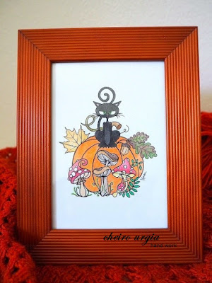
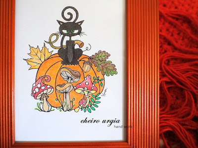
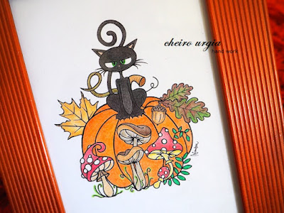
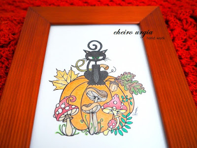
Even though we're in the middle of another summer heatwave, I'd like to show you my first fall-themed creation of the year. I didn't really plan to jump between seasons, but I was offered a GD spot over at Penny's papertake for my win in one of their recent challenges. For my crafting task, I was offered to pick between three lovely digis by Mirtillamente, and somehow, this autumn scene warmed my heart. 
I love how your typical Halloween combo of a pumpkin and a cat is expanded by some lovely mushrooms, as well as some autumn foliage. I immediately felt like creating a non-card project with an image like this, and started acting accordingly: I printed the digi a bit larger than I usually would if it was for a card. I then went to work with my coloured pencils, colouring the motif with warm colours. I decided to stick with a natural colour scheme, and I must say I'm quite satisfied with the result, except for the giant pumpkin: no matter how I tried, I didnt seem to get the shading right. As a resukt, it looks like a huge orange blob rather than a textured vegetable, but I hope that this can be balanced out by all the other details that I managed to get right. 
The cat was a bit tricky to do, too. Of course, it had to be black to match the Halloween pumpkin, but I tried to add a bit of colour with the soft pink ears and green eyes. So far, so good. The other details, however, turned out to be too tiny, and while you may recognize the nose under a microscope, the little vampire teeth became completely invisible amongst the black fur. 
Once the colouring was done, I took an old picture frame from my stash. I wanted to throw it away already as I didn't have any use for it, but I think it will make a fun fall display now with the image in it. I cut the picture to the right size, and inserted it behind the glass. For a while, I thought about painting the wooden frame a different colour, but I decided to leave it like that for now. Mainly it was because I couldn't pick one colour to go with: I guess black would be too much of a contrast as the frame is quite prominent, gold would be too much of a mismatch, and any shade of brown just didn't seem to resonate with me. There's enough of warm autumn colours in my card already, which could prompt me to go the opposite way with green or maybe purple, but in this case, the autumn theme of the image would completely disappear into Halloween. I'm a bit lost and confused here. As a result I'm now stuck with this orange-looking frame that is actually a brown-ish red, but it makes the whole image look a bit too orang-y. I can't say I'm thrilled with that part of my project, and I might paint the frame later to try to find a better solution, but I can't come up with anything at the moment. What would you do in my position? Any crafting tipps or suggestions? 

challenges:
613 avenue create: ATG
a place to start: ATG with optional twist "leaves/trees"
gem of a challenge: ATG (stamp/digi)
allsorts challengeblog: all creations great and small
critter crazy: ATG animals
use your stuff: recycle/upcycle (old picture frame)