12 March, 2021

Yellow

I'm a bit for the Alphabet challenge today as I had a couple of doctors' appointments today and my DT contribution didn't post automatically as it should have. Anyway, we're having a colour theme this fortnight since the letter Y calls for "yellow" on your projects. 
I had to go home two weeks ago, meaning I wouldn't have access to my crafting stuff - a realization that only hit me two days before leaving! The solution was simple: I'd have to come up with something, and I'd have to come up with it fast. The limited time meant I'd have to go with something CAS, and once again, I was saved by the wonderful digis of bugaboo.
I've chosen a simple flower to work with, but didn't use quite a lot of yellow on the image itself. Instead, I opted for a bright yellow background paper, which has a floral pattern embossed on it. As usual, I placed the coloured image on an extra layer of coloured cardboard. The dark brown makes sure the attention stays with the other colours, and also complements the kraft card base. For a bit of fun, I added two strips of ribbons: a green one with clovers, and a red one with white dots on it.
Since their ends would go over the front part of the card, I decided to cover them up by using a punched ornament in yellow and white. I think it does resemble a flower if you use your imagination.
On the inside of the card, I added three smaller blooms made of lace, which complete the floral theme of the card.
Instead of a hand written note, I placed a cutout from a magazine that could be translated as "What makes you feel brave and strong?" It's a rather difficult question to ask yourself, and even more difficult to answer, but it's worth a try. 
The card was meant as a cheer-me-up for mom, which is why I've worked with unusually bright colours, lots of floral things and an overall fun and easy design. It was well received, but the answers might take some more time. 

challenges: 
- 613 avenue create: ATG
- a bit more time to craft: ATG
- a place to start: pick a shape (rectangle, ellipse)
- as you like it: favourite way to cut your image (I'll usually print my images on white paper and cut it to the right size using an ordinary Olfa knife and a ruler. With thicker paper or cardboard, I'll sometimes work with my small scissors to fussy cut, but most of the time I prefer a square shaped cut-out which gives me the opportunity to adjust the height and width of my image. I like how changing the amount of white space around your motif can change the perception of the whole image, and consequently, your whole card.)
- C.R.A.F.T.: feminine
- crafty calendar: feminine
- crafty catz: ATG
- crafty sentiments: ATG
- creative moments: ATG
- cutie pie challengeblog: bunnies & blooms (Valentines or mother's day)
- love to craft: ATG 

04 March, 2021

Heralds of spring

Just a quick contribution to the Friday Flowerday at Holunderbluetchen. 
While I don't have a bouquet for every week of the year, I will certainly have a little arrangement of snowdrops in my apartment each spring. I'm lucky to have them in front of my apartment building where they get quite a lot of sunshine, so I've been waiting for their blooms to open since January. By beginning of February, the snowdrops began to peak from the ground, and mid month they were in full bloom. 
I thought I'd let them grow peacefully this year, but I plucked ab few when I went visiting mom - and they were quite an eye catcher as we had a huge load of snow back home! 
I put them in a small green vintage vase and restrained myself from adding anything else, because, honestly, what could come close to those delicate heralds of spring?

03 March, 2021

Hippie Easter

I'm back with the Fadengrafik Challenge after ages! I've missed a big part of last year's challenges due to my own health issues, and when I was ready to return to my crafting corner, the challenge itself took a break. Anyhow, in 2021 we're back in March we'd like to see your Easter cards.
I'm sure many of you are preparing for the spring/Easter season one way or another. I haven't started anything yet to be honest, but I managed to prepare a little DT inspiration for you in form of a rather unusual Easter card.
It's been my first fadengrafik project since too long, and it was great to see that the needle still runs as it should. I picked a group of Easter bunnies as the focal point of my card and stitched it with metallic yarns. I would usually stick to traditional colours when I work on natural scenes, but I felt like adding some bling for whatever reason. It doesn't look that bad in my opinion, but it turned out to be a real challenge once I wanted to pick a background paper.
From the very beginning, I planned to create a window card so I knew I'd only need a strip of patterned paper, but I couldn't find anything that would match the metallic shades. In the end, I discovered a pack of papers in my stash which included rather unusual sheets. Now, every paper pack has a couple of sheets you just don't use because they don't fit your style, but this one had plenty of them. 
However, since the metallic Easter scene is quite out of my comfort zone as well, I could actually match it with one of the flower-power papers. The floral print is colourful and full of shimmering blooms that complement the metallic yarns without disturbing the scenery. In fact, I think it looks as if I had the weird papers in my stash just for this particular occasion. 
I cut the paper to the right size and made sure to cut a hole in the middle for the bunnies. I wanted to make sure the embossed window frame of the original card base was visible, but I suddenly had too much white around the Easter scene. I covered up a part of it by using silver sticker from my stash - this way I managed to create a shimmering border that would fill the void and connect the focal image with the background. I think it turned out quite OK, how about you?

26 February, 2021

Xtra folds

Can you believe it's already time for another task over at the Alphabetchallenge? Our theme this fortnight is "Xtra folds", meaning we'd like to see more than one fold on your projects.
For the longest time, I was thinking about creating an easel card for my DT inspiration. However, once it came to crafting I wasn't in the mood for measuring and cutting , so I figured I'd have to come up with something else. I went through my folder of patterns for shaped cards to find something suitable and even considered trying origami, but I finally settled on a square card with a folded piece of paper on it.

I've chosen a rather small cardbase this time (9 x 9 cm), and had two projects on my mind. Both were rather simple, but as the first took a turn which made the folds almost invisible, I'll present you the second one today.
Given the small base, the card is rather tiny, but it was all part of the plan. I went with sympathy/thinking of you for the theme, but I meant to create a sympathy note rather than a card if you get what I mean. A tiny something you can add to a bouquet, or an addition to a small gift for the mourning family. Something that will let them know you're thinking about them without this huge blank space inside a sympathy card that I usually find so difficult to fill.

For the inspiration, I went back in time to the White Rose resistance group, whose leading members were beheaded on a February day almost 80 years ago. Coincidentally, the words on the folded piece of paper come from the group's 6th pamphlet, but since I decided to fold the sheet in a way that would leave only portions of the text visible, it is impossible to tell. 
The paper itself has quite a story, too: I had it printed years ago to go with this particular card. However, I opted for another text print back then, and it remained in my stash up until now when everything fell into place. 
When the folds are closed, all you can see is a silver rose sticker. 
Once the folds are opened, the rose blossoms out in a way that creates more space around the bloom, as if the flower has a bit more freedom to develop its beauty. Now you can see that I placed the sticker on a piece of white cardboard, which I then enhanced with a sheet of black cardboard in the background. This way, I managed to create a tiny black border around the card's centerpiece. 
Other than that, I decided to leave the focal point it as it is – no colours, no bling.
In the end, I cut four triangles to enhance the folded edges and add some extra black to the card. As I wanted to add a bit more black, I added another sheet of black cardboard in the background. 

challenges:  

12 February, 2021

W for woodland fauna and/or flora

We're approaching the end of the alphabet over at the Alphabet challenge and have only a few more letters to go. This fortnight's task is dominated by the letter W, meaning we'd like to see woodland flora and/or fauna on your creations.
For my DT inspiration, I decided to cover up another storage box from my stash.
It's the same size as the cupcake themed box I prepared a while ago for the "party" challenge, only that I opted for a paper by Nina Štajner this time. And so, the tube is covered in the most beautiful bunnies, fawns, squirrels, hedgehogs & Co.
Again, the paper ends didn't quite meet which is why I added a strip of dark brown paper. 
Upon gluing everything together, I managed to create a small tear right next to the hedgehog, which luckily isn't all too visible from afar.
Other than that, I think I've done a good job with the edges this time.
Matching the forest animals on the outside, I filled the box with walnuts. However, unlike my squirrel friends might suggest, the treats are meant for myself only this time :) And to make sure nobody pinches a thing, there's a neutral white lid atop of the cardboard tube. 

29 January, 2021

V for vellum

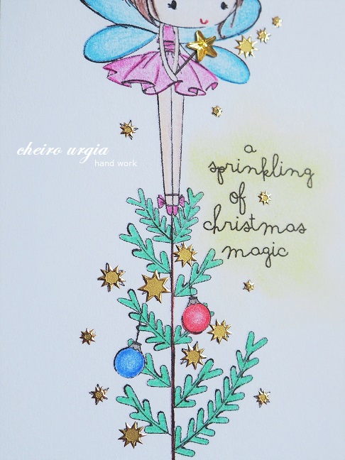
What's shimmering between the branches? 
A strange bright light in the middle of winter, just as a tiny fairy up the tree on Christmas day.

But first things first. We're starting another two-week task at the Alphabet challenge, looking for "vellum" on your crafting projects. I had to look it up, I admit, as I only know it as parchment. 
After a short time of blank confusion, I remembered a stack of vellum sheets in my stash. 
I thought I'd use one of them in the background of a card and place a pretty image atop of it. And I soon figured out which image I'd like to use, too.

I got to pick my prize from All dressed up for being a winner over at the Path of Positivity recently. And since the festive season was still in full blow, I just had to go with this adorable Christmas fairy!
When I started to prepare my DT inspiration for you, I decided to match the wonderful digi with a snowflake patterned parchment paper. To make the pattern more visible, I worked with a kraft card base from the very beginning. I had no idea on the collour scheme yet, but I soon found myself picking unusually bright colours, and quite non-traditional ones: I dressed the fairy in a bright pink dress, and wanted to have the wings stand out, too. 
For the Christmas tree and ornaments, I went with bright green and colours. 
I also added a bit of a blurred yellow fairy dust around the Christmas sentiment.
I added a bit of traditional bling with a sheet of golden paper to enhance the printed image, and I wanted to add some sparkle, too. 
But instead of a golden shimmering coloured pencil, I went straight into my sticker stash. I picked a sheet of tiny stars and placed them where all the digi stars used to be in the original image. 
All the stars? Not exactly. To make the fairy magic stand out amongst all the golden stickers, I decided to use a star-shaped gemstone atop the magic wand.

22 January, 2021

Relax

Breathe in... breathe out... relax...

Amongst all the craziness, 2020 has brought me four wonderful weeks of rehabilitation, and in one of the booklets I received in my welcome package, I found this image of a meditator. I think it was part of a leaflet featuring relaxation methods or something like that, but I'm not sure anymore to be honest. Of course, I'd save it for one of my crafting projects - after all, I'm a hamster when it comes to saving scraps I *might* use one day. 
For a long time, the figure was just meditating in my stash, but here it is featured atop a very simple CAS card.
Since the image says it all, I didn't feel like changing it a lot. I opted for a light grey cardboard as a background, partly because it goes well with all shades of rainbow that are depicted in the yoga scene. On the other hand, the leaflet had a text printed on the back side and I knew it would shine through if I had picked a cream/beige background as I originally planned. 
To make sure the grey picture frame wouldn't end up too meh, I combined it with another grey paper which is a bit darker but actually quite cute due to the glossy swirls.
When everything seemed to be complete already, I found the card a bit too simple. I remembered a set of colourful star stickers from my stash, and picked a star in each colour to match the rainbow ornaments (well, the pink does stand out a bit, but it was the closest match to light purple I could find). In a fun coincidence, the glossy appearance of the stickers matches the grey swirls in the background. 
There isn't much more to add in the end, other than to redirect you over to scrapping4fun where there's an easy ATG challenge going on this fortnight. I've been invited to contribute as GD this time so you won't be seeing me among the linked entries for a change, but I'll sure have a look at what you'll come up with. Also, you'll have the chance to win a little something sponsored by

And for a little more Zen feeling, a beautiful sunset above the old town of Ljubljana. While the nights are pretty cold right now and it takes quite some time for the atmosphere to thaw in the morning, it is still possible to catch a bit of vitamin D in the afternoon hours without turning into an ice cube.

challenges: 
- krafty chicks: CAS
- craft-alnica: ATG
- morgans artworld: ATG
- path of positivity: look for the positive (To me, mindfulness has a great deal to do with positivity, as well as focusing on the good things you find along the way even in bad times. I'm not a supporter of the "everything happens for a reason" attitude though, because, well, sometimes it doesn't. Sometimes it's just a bunch of coincidences that pile up in the wrong way. And when they do, a person has every right to be sad/angry/disappointed/... But of course, despair isn't a state that should be kept alive forever, and at some point, you need to move on. 
I believe that everybody should develop coping strategies that help them along the way - either by themselves, or with the help of family, friends and/or professionals. What will work for you? You never know until you try. 
I for myself tried several techniques of relaxation during my rehabilitation last summer, and to my surprise, I couldn't really help myself with any of them. Not because something was wrong with the therapist, the group or the exercise itself - the methods as such just didn't suit me. I guess my kind of positivity lies within nature, crafting or being alone, rather that in a gym circle listening to somebody's voice. And I'm totally fine with that, because seeing what doesn't work for me made it possible to look for something else, something that would work better towards my needs. Above all, it allowed me to realize that when coincidences line up, I'm the person who starts looking for a tangible plan rather than a CD of relaxation music. Which is fine because that's the thing that works best for me. Still, the simple meditating figure will always be connected with the wonderful care I received during rehab, and I honestly can't wait to go back due to the overwhelmingly positive experience I had - when all they did was basically just let me be and support me along the way.)
- through the craftroom door: ATG
- unicorn challengeblog: CAS
- use your stuff: out with the old (image of meditating figure)
- wortartwednesday: ATG
- worldwide open design team challenge: ATG