30 June, 2023

Green

"Green" is the challenge theme over at the Alphabet challenge blog this fortnight, and as you can guess, we'd like to see green as the dominant colour in your creations. It doesn't need to be a monochromatic project, just make sure this particular colour will be the most prominent thing of whatever you create.
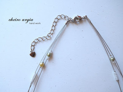
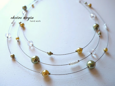
That being said, I'll present you a necklace this time. I have been working mostly with paper for the past weeks and months, creating cards and other paper projects, and I really felt like doing something "non-paper" for a change. I also had a couple of leftover beads that I couldn't use otherwise, and I figured I'd just try to arrange them into something meaningful. I took a store-bought necklace base, and started threading random beads on its strings, as well as lots of crimp beads to keep them in place. I tried to make sure that I didn't repeat the shapes and colours too often, but other than that, the arrangement is completely random. Once I was satisfied with the layout, I fixed the beads with crimp beads, and that's about it. The necklace consists of numerous green beads of different shades and sizes, which I hope will inspire you to use green in your own projects. The non-green elements I used are mainly translucent beads and small arrangements of white pearls, which give a little more dynamic to the creation. Another element is the silver clasp with a heart pendant, which enables you to adjust the length of the necklace. 
In the end, I think it was fun to change my crafting medium for a bit. The necklace seems to be perfect for spring and summer days, as it resembles all the greenery that can be found in nature right now. 
I also like how it looks very airy due to all the "empty" space between the beads - I never created a necklace like this, but I really like how it turned out.

challenges:

22 June, 2023

Hello

Hello and welcome to another belated post from me. We've started a new challenge over at the Alphabet challenge blog last week, and as you may have noticed, we're looking for anything related to flying for the letter "F". 
For my DT inspiration, I decided to present a project that I've created a while ago: a little tag featuring beautiful critters by Nina Štajner. I've acquired them by re-using the cover of her paper collection, and decided to place them onto a black cardboard to create a square tag-like creation. 
I'd use those tag-like pieces to personalize packages for Ukrainian refugees last year. As one particular box was meant for a baby, I thought it would be perfect to use Nina Štajner's patterned paper with animals. On one side of my "card" there is a robin on a branch, as well as a golden "Hello" message. The other side features a little mouse surrounded by foliage. 
Black paper might not be your first colour of choice for cute images like this, but I figured it would be barely visible (which turned out to be corect). Another aspect that made me pick black was the fact that this was the thickest cardboard in my collection, and I had a reason for that, too: Inside of the main box that had to include basic hygiene products and baby items, one could optionally add a small personalized gift. I decided to make that gift by creating a card for a baby, and putting a few extra items into a cellophane bag. To enhance the bottom of said cellophane bag I created hand-made "Welcome" tags which I placed on the bottom of the bag in a way that would make the "Hello" visible from outside, while the other side would be covered by the items in the bag. I didn't glue the tag to the bottom of the bag so that it can be removed and used as a keepsake or decoration. I then closed the bags with twine, adding hand-made wooden ornaments which I'll show you some time later. I didn't take any pictures of the finished bags as they're see-through and I don't feel comfortable sharing other people's gifts. 

There's also a little mistake in my creation: For the welcome message I used a simple "Hello" which I created by using alphabet stickers from my stash. However, as I had previously run out of "L"s in this particular sticker font, I had to improvise by using the number "1" instead. I think it comes quite close to an L, and hope that the solution was good enough to cover up my misfortune. I'll show a few more tags in future to make up for my irregular postings, but I just can't keep up with life at the moment. 

challenges:
- allsorts challengeblog: ATG with optional twist "blooms, bees and/or butterflies"
- critter crazy: ATG animals
- fabnfunky: use a sentiment

02 June, 2023

Birthday troll

Hello and welcome to another challenge over at the Alphabet challenge blog. Thanks for stopping by since the last time I checked in here. I'm crafting exclusively for my bi-weekly DT task at the moment as I still feel absolutely exhausted on a daily basis, but at least my DT spot gives me a reason to do something every now and then. I also received some encouraging results at today's check-up so I hope that things will get back to normal at some point, even though I don't see it coming yet. 
Anyway, we'd like to see easel cards for the letter "E", and I for myself decided to work with that adorable troll girl from Bugaboo. I printed her ages ago, but never really found a project that would suit her. For my easel card inspiration, I decided to combine her with this wonderful birthday-themed background paper. I cut the pieces in a way that would make sure I get to feature all the nice motifs: the pile of presents in the bottom part of the card, and the birthday message in the upright part. Coincidentally, the latter also had a balloon that matches nicely with the balloon that is featured in the digi. And that pretty much sets the tone for my DT project, which is full of matches and coincidences.
To recreate the cheerful mood of a (child's) birthday, I decided to colour the troll girl with bright and bold colours. Unfortunately, the light conditions made it impossible for me to make decent photos - in reality, I used coloured pencils for my colouring, meaning the colours should be way softer and a bit brighter than depicted. Oh, well. 
Once I was done, I placed the motif onto a piece of pink cardboard. I think it goes well with the pink balloon, and it also merges nicely into the overall bright colour scheme. To complete my card, I then took a strip of blue cardboard that featured embossed circles. 
It's only visible when you turn the card around, but I think it's a nice feature that makes sure there's no awkward white space left. And somehow, those embossed circles do remind me of balloons/lanterns, which again puts emphasis on the celebration theme.
To make sure the easel card will stay in position, I wanted to add a banner saying "Happy birthday" onto the bottom of the card. However, I thought it might interfere with the birthday message on the background paper. As an alternative, I opted for huge pink and blue gemstones I had in my stash forever since I hardly ever use this particular size of pearls and gems in my projects. I consider them way too big, which is why they'll be the "leftover pieces" of every sheet of perals/gemstones. This time, their size turned out to be perfect, as they're big enough to stop the upright part of my easel card from collapsing. Also, in a fun twist they match the colour scheme of pink and blue which somehow repeats all over in my card. What a fun crafting coincidence!

challenges: 
- krafty chicks: stamp act
- as you like it: pastels or brights (I opted for bright colours in my project as I feel like they express the joy and happiness that comes with a celebration, especially when it's a child's birthday. I feel like bright colours are the "caps lock" of crafting - the equivalent of being loud in a positive way)
- crafty catz: ATG
- love to craft: ATG 
- nachteulen: ATG

24 May, 2023

Dragonflies

Hello and forgive me for the late appearance over here. I didn't feel well all weekend (no particular illness, just persistent pain issues and feeling overwhelmingly tired), meaning I spent the past days in bed. I'm trying to get back on track again, but I barely find the energy to fulfill bassic evreryday tasks.
Anyway, while I've been away, a new challenge has started over at the Alphabet challenge blog. Our theme this fortnight is "Dragonflies", which is self explanatory. Include a dragonfly on your crafting project and you're in for the game. 
For my DT project, I decided to prepare an embroidered card again. I haven't made paper embroidery in a while, and I was really looking forward to making a card that is not some sort of last-minute CAS project. 
I took this beautiful dragonfly pattern from my stash, contemplating which colour of yarn I should use on it. As I couldn't decide between silver and gold, I decided to have a look at my paper stash and see which papers would better match the dragonfly motif. I found this beautiful pattern of leafs and tiny dragonflies, which I matched with a golden shimmering background paper. To go with the colour scheme, I took a piece of green shimmering paper, and golden yarn for the embroidery. I spent an overall of two evenings pricking and stitching the pattern while listening to ASMR videos on youotube, creating my own ASMR bubble. 
Once I was done, I placed the golden dragonfly onto 3D adhesive pads to distinguish it from the card base. I decided to add a strip of patterned paper in the background while leaving part of the white card base visible, because I think it makes the entire project look more airy. Also, I think the white card base goes well with the white cardboard in the background of the golden dragonfly. In the very end, I decided against adding a couple of rhinestones as I thought I'd limit the shimmer to the two papers and the dragonfly motif.
A little contribution to the collection of hand-stitching at made with Blümchen.

challenges:
- krafty chicks: CAS
- C.R.A.F.T.: ATG
- crafty catz: ATG
- critter crazy: ATG animals
- little red wagon: flora or fauna
- nachteulen: ATG
- path of positivity: inspired by nature
- sparklesmonthlychallenges: things with wings
- male room: animals
- use your stuff: use a technique (paper embroidery - I'm not sure whether it fits your definition of technique, if not, feel free to remove me from the link-up)

06 May, 2023

Cats

Hello and welcome back to the Alphabet challenge. Before we start with the new challenge, I'd like to thank everybody who played along at the challenge I hosted. It was a small selection of participants, but I really hope you all had fun with your black & white projects. For the letter C, we have an easy task again: we'd like to see "Cats", so make sure to feature those furry creatures on whatever you create.
I for myself needed quite some time to navigate through that theme. First, I wanted to use one of those beautiful vintage cat images to create a multi layer vintage card. Then, I thought I'd use paper embroidery. I picked a couple of cat patterns, but right before I could pick my favourite, I happened to catch a nasty angina from my mom. I could barely breathe and swallow for about a week, and needless to say, I hade to put my crafting on hold. Once I was OK again, I didn't have the time to focus on something super time-consuming. Looking for alternatives, I remembered this beautiful background paper with paw prints from my stash. I'm not sure whether it features cat or dog paws, but when I looked them up on the internet, I figured that both look kind of similar. I placed the paper onto a kraft card base, and started looking for cat elements that would go with it. 
I thought I'd go with something simple to make sure the paper in the background will still be visible, and in the end, I opted for a cat silhouette. The image comes from the internet, I transfered it onto black cardboard and fussy cut the outlines. I then placed it onto a piece of white cardboard, which I enhanced with a piece of black paper. I then used 3D adhesive pads to mount the image onto the card base. Once that was done, I tried to figure out a way to embellish the cat silhouette. I tried paper flowers and punched butterflies, but nothing seemed to fit: no matter what I did, the card looked too thick, too busy, and overall, too "blah". 
In the end, I took three black rhinestones and placed them into the left upper corner. I'm not entirely happy with the result, but it's the best I could come up with. I hope my cat creation will inspire you to join us in our link-up, if not, you may find your inspiration in this princess that resides at mom's aunt's place. 
If neither seems to work for you, I suggest you have a look at what my DT mates have prepared :)

challenges:
- crafty catz: ATG with optional twist "masculine"
- critter crazy: ATG animals
- love to craft: ATG 
- path of positivity: ATG positive with optional twist "inspired by nature"

21 April, 2023

Black & white

Hello and welcome to a new challenge over at the Alphabet challenge blog. It was my turn to pick the theme for the upcoming fortnight, and I'll be picking the winners, too. 
I decided to go easy with a "Black & white" challenge for the letter B. You can link up anything you like as long as it includes those two colours only. I can't wait to have a look at your creations! First things first, though, let me telly you that our DT has prepared some awesome inspirational projects for you, so jump over to their pages to have a look!

I for myself present you a black and white card. It's a rather simple project, and honestly, it was a bit of a crafting accident. At first, I thought I'd create a non-card project for you, but with some unexpected errands, I wouldn't be able to spend much time in my crafting corner. That being said, I started looking for black and white papers to create a card. I wanted to create something along the lines of "simple, but effective", meaning to hide the fact that it would be - again - a rather quick and easy card from me. However, it was easier said than done, as I had to realize that papers with black and white only were hard to find. I do have black cardboard in my stash, as well as different white papers, mostly with embossed motifs, but I couldn't possible think of a way to combine them into something meaningful without adding some other colour. Finally, I remembered those swirly black and white sheets I got myself ages ago when I was visiting my sister in Wuppertal. I figured I could combine them with some black and/or white papers from my stash, but I didn't want to produce a sympathy card, so I went for the next best occasion: an elegant black & white birthday card. I cut a piece of black cardboard and placed it onto a white cardbase. I then cut out a piece of the patterned paper, and tried to place it onto the card. I didn't want to fully cover the base, as I figured that an asymetrical arrangement would be better for such a colourless card. Also, I thought it would be a real challenge to place a sentiment and/or embellishments onto a card that would consist of square elements only. 
That being said, I decided to place the patterned paper in the upper part of my card, while the lower part would remain black. This way, I created a blank canvas that could feature a simple (birthday) greeting. The text is printed, cut, and placed onto a strip of black paper. I like how it's almost invisible against the black background as I didn't use 3D adhesive pads, as if the greeting comes out of nowhere. However, upon closer inspection you may realize that there's a tiny "step" in place of the sentiment, as the additional cardboard layer stands out a bit as the additional layer of cardboard distinguishes from the background. 
Now for the accident part: For the upper part of my card, I originally planned to use the other side of the patterned paper, namely the one that features black floral swirls on the white background. However, when I turned the piece around to apply adhesive tape, it struck me that the white-on-black pattern looks even better on the card. I think it has to do with the fact that the black background melts into the black cardbase, whereas the white background would be standing out, not merging with the blackness around it. 

Once both pieces were secure, I couldn't help feeling like something was missing. In an attempt to fix the issue, I took a strip of tiny white pearls from my stash, and placed two lines of pearls in the lower part of my card: one line lies directly on the lower end of the card, white the other marks a border between the black card base and the patterned cardboard. It's interesting to see how this little step changed my project completely, bringing attention to the bottom part of my card, creating some sort of frame for the sentiment. With a limited selection of papers and embellishments, the card itself ended up very gender neutral, however, I can't help visualizing a male recipient. I'm not sure whether the load of pearls I added is suitable for a gentleman or not, as I would never place that amount of pearls on any card, but as they seem to blend in well with the background they might be acceptable still. What do you think? 

challenges:

07 April, 2023

Adorable

Hello and welcome to yet another challenge over at the Alphabet challenge blog. We're at the beginning of the Alphabet again, and for the letter A, we'd like to see "Adorable" creations. It should be an easy task for you as you can show us literally anything under the condition that it's cute. 
As the challenge starts just in time for  Easter, I decided to create a quick Easter card. 
The image I worked with comes from a pack of patterned papers created by Nina Štajner, however, it is not the paper itself I used. I saved these adorable Easter bunnies from the album cover, as they were way too cute to land in the trash. Once I cut out the main motif, I placed it onto a green background paper. I then used 3D adhesive pads to glue the image onto a white embossed paper with swirls. For the card base, I took some kraft paper as it seemed to fit the earthy tones of my creation.
I like how the pattern gives a bit of life to the scenery without taking too much attention away from the bunnies. Also, it could resemble a bit of April snow as the last couple of days have been very cold. For a bit of bling, I then added a couple of shimmering rhinestones. I opted for a light green shade as I thought it would match the pastel colours of my card. 
The card has already found a new recipient as the bunnies hopped off to a wonderful lady I've met last year. It's a mix of an Easter greeting and a "Thank you" card, which is why I've deliberately left it without a sentiment. Nevertheless, it was well received and will have a special place in her office :) 

challenges:
- allsorts challengeblog: ATG with optional twist "spring garden"
- as you like it: pearls or gems (I like to use both of them and often find myself adding pearls and/or gems long after I thought I was done with my projects. I'll opt for gems if I feel like my card needs a bit of bling, as I don't really use glitter or other forms of sparkle. I think gems are a perfect alternative as they don't make a mess, they come in different colours, and also act as a nice 3D element which makes it possible for me to create depth in my creations. I also think that in contrast to "normal" pearls, their shiny appearance will create a more lively card, while the touch-up by using pearls seems to be more static if that makes sense.)
- crafty catz: ATG
- crafty gals corner: make it green
- creative inspirations: ATG
- creative moments: ATG with optional twist "for a special lady"
- critter crazy: ATG animals
- little red wagon: spring or fall (definitely spring for me - I'm beyond happy with long sunny days, and all the blooms that are blossoming)
- love to craft: ATG 
- morgans artworld: ATG
- my time to craft: Easter/spring flowers
- pearlysparkles: all creatures great and small
- pennys papertake: ATG
- unicorn challengeblog: add an animal
- use your stuff: Easter